Google Play Screenshot Size: The Short Answer
Google Play does not hand you a list of exact sizes the way Apple does. It gives you a range and a ratio. A screenshot can be a JPEG or a 24 bit PNG with no alpha channel, each side has to be between 320 and 3,840 pixels, and the long side can be at most twice the short side. Those three rules come from Google's Play Console Help page on preview assets, which is the page every number on this guide was checked against on November 13, 2026.
Inside that range, one size does almost every job on a phone: 1080 x 1920 pixels in portrait, or 1920 x 1080 in landscape. It passes the upload rules and meets the 1080 pixel floor Google sets for its large recommendation formats. Upload at least four of them for an app (three for a game) and you have done what Google asks before it will consider your screenshots for those bigger placements.
Then there are the other pieces of the listing. The feature graphic is exactly 1024 x 500 pixels and is required. The app icon is exactly 512 x 512 pixels, a 32 bit PNG of at most 1024 KB, and is required too. Tablets, Chromebooks, Wear OS watches, Android TV, cars and Android XR headsets each have a slot of their own with rules of their own, all covered below.
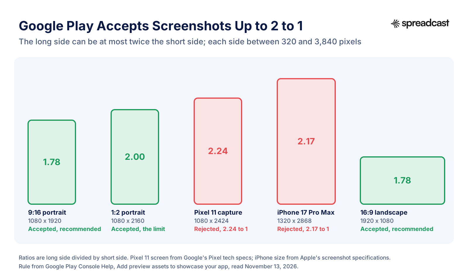
One warning before you open your design tool. A screenshot straight off a modern Android phone is usually too tall for Google Play. A Pixel 11 screen is 1080 x 2424 pixels according to Google's Pixel tech specs, which is 2.24 times taller than wide, so Play Console refuses it as it is. You have to crop it or place it on a 9:16 canvas. The section on raw captures explains how.
This page is Google Play only. If the same app is also on iPhone and iPad, Apple's sizes are completely different and live in our guide to App Store screenshot sizes. Plan two sets of files from the start; you can share a design between the stores, but not the exports.
Google Play Screenshot Size Requirements at a Glance
These are the rules Play Console checks when you upload, plus the ones that decide whether Google will use your screenshots in its larger formats. Google calls the first group requirements, which can lead to removal or suspension if broken, and the second group highly recommended, which affects how and where your assets appear. All of it is from Google's preview assets page.
| Rule | What Google says |
|---|---|
| File format | JPEG or 24 bit PNG with no alpha. A PNG with a transparency channel is not accepted. |
| Smallest side | 320 pixels. |
| Largest side | 3,840 pixels. Tablet and Chromebook screenshots get a wider range, from 1,080 to 7,680 pixels. |
| Aspect ratio | The long side can't be more than twice the short side. So 9:16 and 16:9 are fine, 1:2 is the limit, and 20:9 is refused. |
| Minimum to publish | At least two screenshots, counted across all device types together. |
| Maximum | Up to 8 screenshots for each supported device type. |
| Device types with their own slots | Phones, 7 inch tablets, 10 inch tablets, Chromebooks, Android TV, Wear OS watches, Android Automotive OS cars and Android XR headsets. |
| Large format recommendations (apps) | At least 4 screenshots with a minimum of 1080 pixels: 1080 x 1920 or larger in 9:16 portrait, or 1920 x 1080 or larger in 16:9 landscape. |
| Large format recommendations (games) | At least 3 landscape screenshots at 1920 x 1080 or larger, or 3 portrait screenshots at 1080 x 1920 or larger, showing real gameplay. |
| Captions | Taglines only when needed, taking up no more than 20 percent of the image. |
| File size | Google's page lists no file size limit for phone screenshots. It states 8 MB per file for Android XR, and AppTweak's size guide gives 8 MB for Google Play screenshots in general, so keeping each file under 8 MB is the safe choice. |
| Where you upload them | Play Console, Grow users, Store presence, Main store listing, in the Graphics section. |
Checked against Google's Play Console Help on November 13, 2026. Assets you add show on your store listing across all test tracks as soon as you add them, so a half finished set is visible to testers too.
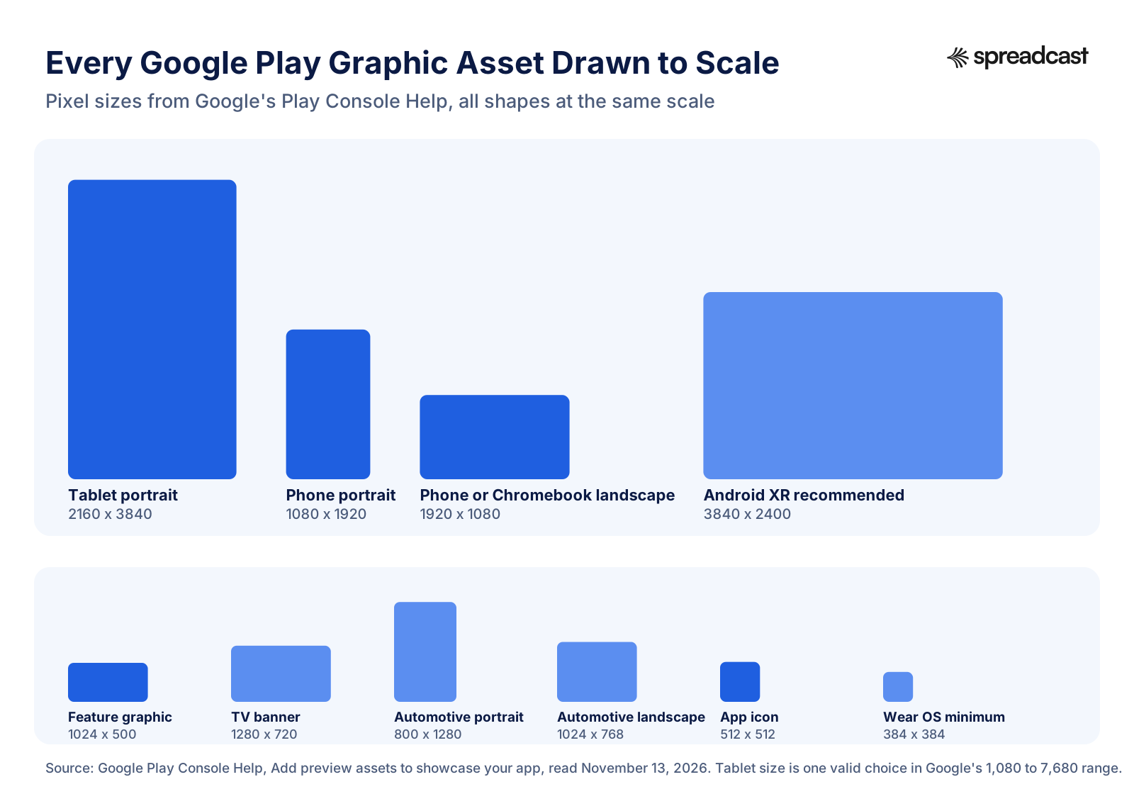
Every Google Play Asset Size Drawn to Scale
Seeing the assets side by side makes one thing obvious: the feature graphic and the icon are small, fixed files, while the screenshots can be large and come in many shapes.
Recommended Google Play Screenshot Sizes in Pixels
Google gives ranges, so the sizes below are the practical picks: each one passes every rule on Google's page for its slot and keeps the arithmetic simple when you export from a design tool. Width comes first.
| Slot in Play Console | Recommended size | Also accepted | Notes |
|---|---|---|---|
| Phone, portrait | 1080 x 1920 | 1440 x 2560 or 2160 x 3840 (same 9:16 shape, sharper) | The size to make first. Meets the 1080 pixel floor for large format recommendations. |
| Phone, landscape | 1920 x 1080 | 2560 x 1440 or 3840 x 2160 | Use it for games and video apps that run sideways. |
| 7 inch tablet | 1080 x 1920 portrait or 1920 x 1080 landscape | Anything 9:16 or 16:9 from 1,080 to 7,680 pixels | Google asks for at least 4 screenshots on large screens. |
| 10 inch tablet | 2160 x 3840 portrait or 3840 x 2160 landscape | 1440 x 2560 or 2560 x 1440 | Larger files look sharper on big screens. Staying at or under 3,840 keeps you inside the regular screenshot cap too. |
| Chromebook | 1920 x 1080 landscape | Up to 7,680 pixels on the long side, 16:9 | Chromebooks are mostly landscape, so lead with landscape captures. |
| Wear OS | 384 x 384 or larger, square | Any 1:1 size from 384 pixels | Interface only. No frame, no added text. |
| Android TV | 1920 x 1080 | 3840 x 2160 | Shown only on Android TV devices. A 1280 x 720 TV banner is also required. |
| Android Automotive OS | 800 x 1280 portrait and 1024 x 768 landscape | No other sizes listed | If you provide them, at least 2 of each, taken on a generic system image. |
| Android XR | 3840 x 2400 | 1920 x 1200 minimum, 8:5 | 4 to 8 screenshots, PNG or JPEG, up to 8 MB each. |
Google's large screen rules (tablets and Chromebooks) allow up to 7,680 pixels while its general screenshot rules cap the long side at 3,840. The two numbers sit on the same page, and we could not find Google explaining which wins for tablets, so the 10 inch row stays at 3,840 to pass both. Sizes checked on Google's preview assets page on November 13, 2026.
Why a Raw Android Screenshot Is Too Tall for Google Play
This one surprises people on a first upload, and it is a little absurd: Google's own phones produce screenshots that Google's own store refuses. Phone screens got taller over the last decade, and the store rule stayed at 2 to 1.
Here are a few current screens from Google's Pixel hardware tech specs. The Pixel 11 and Pixel 10a are 1080 x 2424 (2.24 to 1). The Pixel 11 Pro is 1280 x 2856 (2.23 to 1). The Pixel 11 Pro XL is 1344 x 2992 (2.23 to 1). The outer screen of the Pixel 11 Pro Fold is 1080 x 2342 (2.17 to 1). Every one of them is past the limit. Even the older Pixel 8a at 1080 x 2400 (2.22 to 1) is too tall.
It is not just Pixels. StatCounter's worldwide mobile screen resolution figures for October 2026 list the most common viewports, measured in CSS pixels rather than hardware pixels, and several of the big Android ones have the same tall shape: 360 x 800 holds 8.57 percent of the share and 384 x 832 holds 7.24 percent, which works out to 2.22 and 2.17 to 1. A typical phone today is roughly 20:9, and 20:9 does not fit into 2:1.
You have three honest ways out. First, crop: cut the capture to 1080 x 1920 by taking about 500 pixels from the top or bottom. On a scrolling list or a feed this costs you nothing important. Second, place the capture on a 9:16 canvas: scale it down and put a short caption or a plain brand color in the space above it. Third, capture on an emulator with a 16:9 profile, so the app lays itself out at the right shape in the first place. Stretching or squashing the capture is the one thing not to do, because Google lists stretched or compressed images among the things to avoid.
Before you capture, clean the status bar. Google asks you not to show carrier names or notifications and to show the battery, WiFi and signal icons as full. On Android 7.0 and higher you can do this with demo mode, which Android Studio's screenshot guide describes: open Settings, then Developer options, then Demo mode, and turn on Show demo mode. The same guide shows how to save a capture straight to your computer from Logcat, and warns that its Frame Screenshot option stretches the image when the frame belongs to a different device.
Google Play Screenshot Aspect Ratio: What Passes and What Fails
Everything up to 2 to 1 is accepted, in either orientation. The two red shapes are what you get from a current Pixel and a current iPhone without any editing.
What Qualifies Your Screenshots for Promotion on Google Play
Google uses screenshots in more places than your listing. Some sections of the Play Store show groups of recommended apps and games in a large format built from screenshots, and to be eligible for those formats Google turns its recommendations into hard requirements.
For apps, that means at least four screenshots at a minimum of 1080 pixels on the short side: 9:16 portrait at 1080 x 1920 or larger, or 16:9 landscape at 1920 x 1080 or larger. For games, it is at least three landscape screenshots at 1920 x 1080 or larger, or three portrait ones at 1080 x 1920 or larger, and they have to show the in game experience so a player can tell what the gameplay is like. Four 1080 x 1920 screenshots of your real interface is the simplest way to tick every box.
Two smaller details matter here. Google allows stylized screenshots that run one picture across several images, but asks you to put real interface first in the first three. And it wants the actual app, captured from the app, without people's fingers tapping a phone unless the app itself is used off the device.
Recommendation formats are not the same as editorial featuring, which is a hand picked placement. Google's guide to getting featured on Google Play says your marketing assets must meet a high standard for your app to be eligible for increased discovery or featuring, next to the quality of the app itself. Good screenshots will not get a weak app featured, but weak screenshots can keep a good one out. If your title is a game, our mobile game marketing guide covers the rest of the launch around it.
Google Play Tablet Screenshot Size and Chromebook Screenshots
Tablets and Chromebooks are grouped by Google as large screens. The 7 inch tablet, 10 inch tablet and Chromebook each have their own slot in the Graphics section, and the rules are the same for all three: between 1,080 and 7,680 pixels, 16:9 for landscape and 9:16 for portrait, and a minimum of four screenshots to show your in app experience.
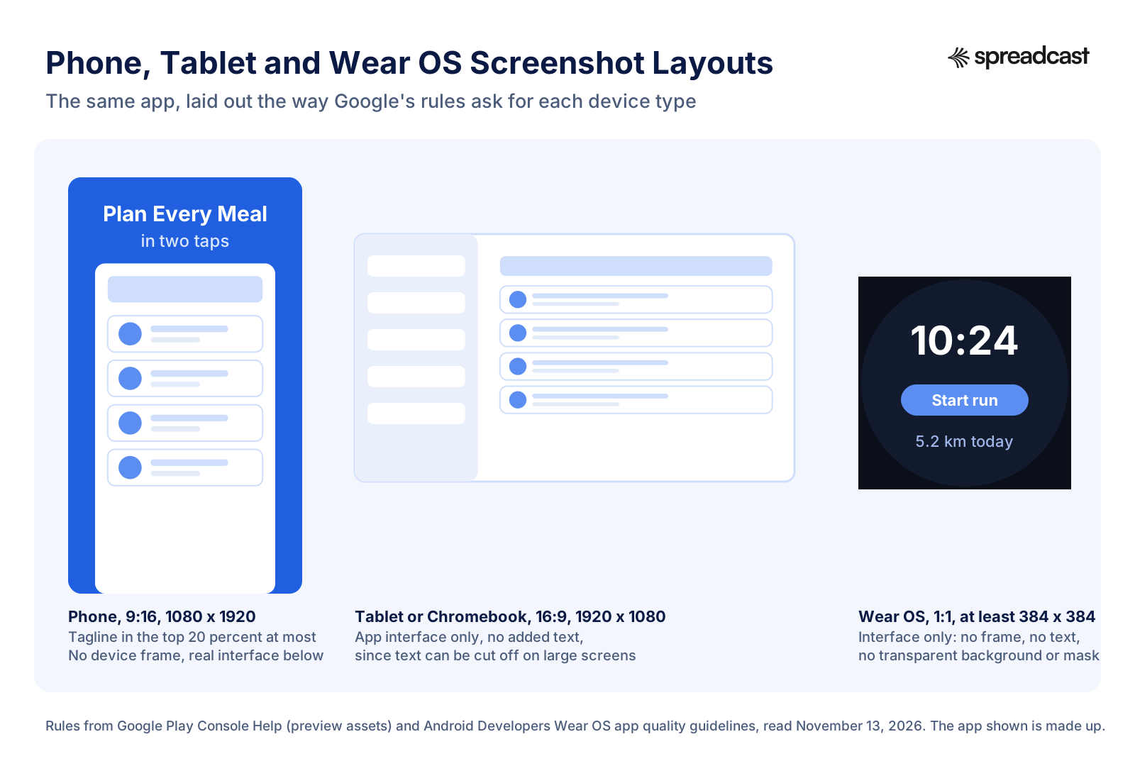
The rule people miss is about text. Google asks you to leave out any extra text that is not part of the core app experience, because it can be cut off on Play homepages on certain screen sizes. So the caption band that works well on a phone screenshot should not be copied onto a tablet one. Show the interface on its own and let the layout do the talking.
Chromebook slots are newer. When Google added them, the Android Developers Blog post from October 2022 said they accept up to 8 screenshots that are shown mainly on the Play Store for Chromebooks, on both the listing page and Play homepages. The same post explained why: Chromebook users were seeing phone or tablet screenshots that did not show what the app looks like on a laptop sized screen.
Do you need tablet screenshots at all? If your app runs on tablets, it is worth it. Google's adaptive app quality guidelines ask developers who improve their app for large screens to upload screenshots that show the app on tablets and foldables, so people can see the experience before they install. If your app has no tablet layout, a stretched phone screen in the tablet slot only advertises that, and you are better off waiting until the layout exists.
Foldables sit in between. The inner screen of the Pixel 11 Pro Fold is 2076 x 2152 pixels in Google's Pixel tech specs, almost square. A capture from it passes the 2 to 1 rule, but it is neither 16:9 nor 9:16, which is what Google asks for in the large screen slots. Crop a 16:9 band from it (2076 x 1168 in landscape) to use as a tablet screenshot, and use the outer screen, after cropping it to 9:16, for the phone slot.
For the capture itself, run the app on a tablet emulator in landscape, which is the way most people hold a tablet, and save at the emulator's native resolution. A tablet emulator at 2560 x 1600 gives 16:10, not 16:9, so crop 160 pixels of height (2560 x 1440) or lay the capture onto a 16:9 canvas before you upload.
Wear OS, Android TV, Android Automotive OS and Android XR Screenshot Sizes
Each of these has its own slot and its own rules, and they are stricter than the phone rules. Sizes come from Google's preview assets page; the extra detail in the notes comes from the Android Developers quality guidelines for each platform.
| Platform | Size and format | How many | Rules worth knowing |
|---|---|---|---|
| Wear OS apps | 1:1 square, at least 384 x 384 pixels | At least 1 that shows the current version | Interface only. No device frames, no added text, graphics or backgrounds, no transparent background or masking. If the app has Tiles, Google recommends a screenshot of them. The Wear OS app quality guidelines note that Android Studio, from Hedgehog onwards, has a Play Store Compatible option in its Take screenshot dialog. |
| Wear OS watch faces | 1:1 square, at least 384 x 384 pixels | At least 1 | Show the watch face only, and if it can be customized, show more than one of its variations. |
| Android TV screenshots | Same rules as phone screenshots; 1920 x 1080 is the natural pick | At least 1 before you can publish to TV | Shown only on Android TV devices. The TV app quality guidelines ask for an unaltered, high resolution screenshot that shows the current TV experience. |
| Android TV banner | 1280 x 720, JPEG or 24 bit PNG with no alpha | 1, required for a TV app | Shown only on Android TV. Think of it as your app icon on TV. Separately, the app itself needs a 320 x 180 launcher banner with the app name in it, one per language, as Google's TV setup guide explains. |
| Android Automotive OS | 800 x 1280 portrait and 1024 x 768 landscape | If provided, at least 2 portrait and 2 landscape | Required unless the app is in a parked app category. Must show the generic system interface, not one car brand. Take them on the emulator's Automotive (1024p landscape) and Automotive Portrait profiles. The car app quality guidelines set the category rules. |
| Android XR | 8:5, 3840 x 2400 recommended, 1920 x 1200 minimum, PNG or JPEG up to 8 MB | 4 to 8 | Google also allows two extra XR videos, described in the video section below. |
One small mismatch to know about: the Android Developers page on distributing to cars prints the landscape size as 1024 by 786, while Play Console Help says 1,024 by 768, which matches the emulator profile name. Use 1024 x 768. The car page also says Automotive screenshots must be on the main store listing and on any custom store listings.
Phone, Tablet and Wear OS Layouts Side by Side
One app, three different sets of rules. A caption band works on a phone, a tablet wants the interface alone, and a watch wants nothing but the watch screen.
Google Play Feature Graphic Size: 1024 x 500 Pixels
The Google Play feature graphic size is fixed: 1024 x 500 pixels, as a JPEG or a 24 bit PNG with no alpha. There is no range and no alternative size, and you must provide one to publish your store listing.
The shape is about 2.05 to 1, which is close to but not quite 2:1. That matters if you build it from a template made for another banner. A 1200 x 600 social banner is exactly 2:1 and will not scale cleanly into 1024 x 500; you either crop 12 pixels of height after scaling to 1024 wide or redesign. Start from a 1024 x 500 canvas instead.
Search for "Play Store banner size" and you will find two different answers, which AppRadar's Google Play size guide also points out. The feature graphic (1024 x 500) is for every listing. The TV banner (1280 x 720) is only for apps that run on Android TV. If your app is not on TV, you only need the first.
The file is small, so keep it simple. Google warns that fine details will not be visible on many phone screens, and the graphic is shown in context with your app icon, with a play button laid over it whenever you have a video that does not autoplay. A clear idea in the middle, a strong background color and very little text beats a busy collage every time.
Google's feature graphic rules also overlap with the icon. It asks you not to use prominent branding that looks like your app icon, because the two are often shown together and the repeat looks like a mistake. Use the feature graphic to show what the app does or what using it feels like, and leave the logo to the icon. Pick its colors with care, because they tend to spread: Spreadcast, for one, reads your listing to choose the brand colors for your social posts, so a consistent store palette becomes a consistent feed. To check your 512 pixel icon file before upload, use the app icon size checker.
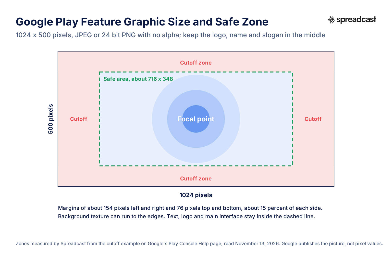
Google Play Feature Graphic Safe Zone
Google marks the edges of the feature graphic as cutoff zones, where key elements may be cut off depending on the format. It publishes the picture, not pixel values, so we measured its example.
Google Play Feature Graphic Guidelines
Google lists two required items for the feature graphic (the size and the format) and a long list of strong recommendations. Breaking the recommendations will not remove your listing, but Google says it may change how your assets appear or limit promotional opportunities. These are the ones that shape the design, from Google's preview assets page.
Keep the Focal Point in the Center
Logo, app name, slogan and the main piece of interface go in the middle. Google's example marks the outer band on all four sides as a cutoff zone, and some formats lay extra interface over the graphic. If key elements sit in those zones, Google says the graphic may not be eligible for those formats.
Let the Background Run to the Edges
Background elements belong at the edges, so the graphic still looks complete when it is cropped. A gradient, a pattern or a photo that bleeds off all four sides survives any crop. A thin border or a frame does not.
Use Vibrant Colors, Not White or Dark Gray
Google asks you to avoid pure white, black and dark gray, because they blend into the Play Store background in light and dark mode. It also asks for a color theme that matches your icon and your app, so people can connect the three at a glance.
No Ranking, Price or Promo Words
Words such as Best, #1, Top, New, Free, Discount, Sale or Million Downloads are out. So is anything that suggests store performance, user testimonials, awards or price. Time sensitive copy should be avoided, and seasonal art should be swapped in and out on time.
No Device Images or Store Badges
Google lists device imagery among the elements to avoid, because it dates quickly and can put off people who use a different phone. Google Play badges, other store badges and third party trademarked characters or logos without permission are out too.
Write Alt Text for It
Google asks for alt text on each graphic asset for people using screen readers: 140 characters or fewer, describing the important part, without starting with photo of or image of. An example from Google's own page: The transaction complete screen.
Where the Feature Graphic Shows, With and Without a Video
Google lists three places for the feature graphic. It is the cover image for your preview video, if you have one, and people tap the play button laid over it to watch. For apps, Google shows collections of apps in a large format using the feature graphic, ads included. For games, Google shows groups of recommended games in a large format with preview videos and screenshots, and the feature graphic is used there.
Notice what is not on that list: a banner at the top of every listing page. Without a preview video, your feature graphic does most of its work in those large collections rather than on your own page. With a video, it becomes the first thing people see on your listing, because the video shows before your screenshots and the feature graphic is its cover whenever the video does not autoplay.
This is why AppTweak's guide to store assets says the feature graphic is less prominent than it once was, while still mattering if you have a video or get featured. In practice, design it as if it will be your video cover, because the day you add a video, it will be. One exception: spatial videos for Android XR use their YouTube thumbnail as the cover, not the feature graphic.
A graphic that works as a cover has an obvious center for the play button to sit on, no small text that the button would hide, and a scene that makes someone want to see it move. A flat logo on a gradient does none of those things.
Google Play Preview Video Requirements
The preview video is optional, but Google highly recommends one, especially for games, and some parts of Google Play only show games that have one. You add a single YouTube link in the preview video field. The rules below are from Google's preview assets page.
| Rule | What Google says |
|---|---|
| Link | One YouTube video URL. Not a playlist, not a channel, and no extra parameters such as a timecode. |
| Ads | Ads must be off for the video to show on Google Play. Turn off monetization, or upload a different video without monetization claims. If the video uses copyrighted content with a claim, turning monetization off may not be enough, and you need a different video. |
| Privacy | Public or unlisted, never private. An unlisted video can be watched by anyone with the link but stays out of YouTube search and your channel's video tab, as YouTube Help on privacy settings explains, which makes it a good fit for a store video. |
| Age and embedding | Not age restricted, and embeddable on Google Play. |
| Autoplay | May autoplay inline with the sound off for up to 30 seconds, depending on the device, settings, connection and surface. When it does not autoplay, a play button sits on your feature graphic. |
| Where it shows | Before your screenshots on the listing, and possibly on the home and search pages. For games, in large format groups of recommended games. |
| Orientation | Landscape or portrait are both supported. Pick the one that matches the app, and don't leave black bars on the sides of a portrait video. |
| Content | Show the real app within the first 10 seconds, aim for at least 80 percent of the video to represent the real experience, and keep title screens and logos short. |
| Text in the video | No ranking, price or promo claims, and no calls to action such as Download now or Play now. Google Play's own awards, such as Best Of, may be shown. Use captions for people watching without sound. |
| Android XR extras | Up to two more videos: a spatial one (360 degree, 180 degree or 3D) shown only on XR headsets, and a non spatial one shown on headsets and in the XR section of the listing on phones and tablets. Both must be public or unlisted, ads off, not age restricted. |
Google's page sets no length limit, only the advice to keep it short because only the first 30 seconds autoplay. Planning, recording and editing a store video is covered in our app preview video guide, written for Apple's previews but useful for a Play video too.
Google Play Icon Size: 512 x 512 Pixels
The Play Store icon size is 512 x 512 pixels, a 32 bit PNG with alpha, at most 1024 KB. Those three requirements are on Google's preview assets page, which adds that the store icon does not replace your app's launcher icon; it is a higher resolution version that has to follow Google Play's icon design specifications.
Those specifications are on the Android Developers page for Google Play icon design, and they explain two things that surprise people. First, upload a full square. Google Play applies the rounded corners itself, with a radius equal to 30 percent of the icon size, so if you round the corners yourself they get rounded twice. Second, leave out the drop shadow. Google Play adds its own shadow around the final icon. Shadows and lighting inside the artwork are fine; a shadow around the outside of the asset is not.
The same page asks for the sRGB color space and warns that transparent areas show the Play Store's background color through them. In practice, give the icon a solid background in your brand color. On badges and text, Google's rule is the same as for the feature graphic: nothing that suggests ranking, price, a Google Play category or a Play program, and no symbols that mislead. Google's Metadata policy gives the example of a message dot on an icon when there are no messages.
Don't mix this up with the launcher icon inside your app. That one is an adaptive icon with layers of 108 x 108 dp and an inner safe zone of 66 x 66 dp, according to Google's adaptive icons guide. The 512 pixel store icon is a flat image. The app icon size checker tests a file against the Google Play and App Store sizes in one go, and its page lists the launcher icon sizes as well.
Google Play Screenshot Guidelines: What Google Rejects
Screenshots are metadata, so they fall under Google Play's Metadata policy, which does not allow misleading, irrelevant, excessive or inappropriate metadata, screenshots and promotional images included. The specific rules below come from the preview assets page and Google's best practices for your store listing.
Ranking and Promo Claims
Nothing that suggests store performance, ranking, awards, user testimonials, price or promotions. Google's examples for screenshots are Best, #1, Top, New, Discount, Sale and Million Downloads. The best practices page adds App of the year, Popular, award icons, 10% off and free for a limited time only, and the Metadata policy adds anything that suggests a Google Play program, such as Editor's Choice.
Calls to Action
Google asks you to avoid any form of call to action in screenshots, naming Download now, Install now, Play now and Try now. The install button is already on the page, so a caption that repeats it wastes the space and breaks the guideline.
Device Frames and Fingers
Device imagery is on Google's list of elements to avoid in screenshots, because it becomes obsolete quickly and can alienate some users. For Wear OS it is a hard rule: no device frames at all. Hands tapping a phone are also out, unless the app is used off the device. Show the interface itself.
Store Badges and Borrowed Logos
No Google Play badge, no App Store badge, no other store's icon, and no third party trademarked characters or logos without permission.
Too Much Small Text
Taglines only when needed, under 20 percent of the image, in a size people can read on a phone. Google warns against small fonts and against backgrounds that fight the text. Its best practices page sums it up in one line: keep text to a minimum.
Low Quality or Misleading Images
No blurry, pixelated, stretched, compressed or sideways images. No screens that misrepresent what the app does. No real world phone numbers, contacts, addresses or other personal information; Google's best practices page lists these under deceptive behavior. In practice that means test accounts with made up data when you capture.
Video: Google Play's Store Listing Policy Explained
A short policy walkthrough from Google for Developers India, part of its PolicyBytes series, covering the Metadata policy, the rules on ratings, reviews and installs, and app promotion.

How Many Screenshots Show in Search and on Your Listing
Google does not publish a fixed number for search results. Its preview assets page says only that screenshots may be displayed throughout Google Play, in search and on the homepage as well as on your listing. On the listing, the order is clear: the preview video first if you have one, then your screenshots from left to right, with the ones best suited to the device the person is browsing on.
What you can control is the first three. Google asks you to put real interface first in the first three screenshots when you use a stylized set. Third party tools that study store pages agree: AppTweak's screenshot guide says the first three have the biggest influence because users rarely scroll past them, and AppRadar's guide calls search results the placement that matters most, since many people decide whether to tap from those first images before they ever open the listing.
So write the set as a short story read from the left. Screenshot one says what the app is for, in the plainest words you can find. Screenshots two and three each show one main feature. Four to eight cover the rest for people who are already interested. Each image has to make sense alone, because you never know where someone stops.
If you want to see how other apps sequence their first three, our App Store screenshot examples break down real sets screen by screen. The examples are from Apple's store, but the reasoning about the first frame carries straight over to Google Play. For the wider picture of how listing changes move installs, see our page on app store conversion rate.
Localized Screenshots, Custom Store Listings and Experiments
Google Play lets your graphics change by language and by audience, and it lets you test them. Start with languages. Google's page on translating your app says you can add localized graphic assets for each store listing language, and that if you add text translations without localized graphics, your graphics show from the default language. So a French listing with English captions on the screenshots is what you get unless you upload French screenshots too. Google also asks you to localize taglines and text overlays, while in game interface does not have to be localized for each market.
Next, audiences. Custom store listings let you make up to 50 alternative listings, each with its own name, icon, descriptions and graphic assets, shown by country or tied to other targets such as a Google Ads campaign. Google's own example is a listing for Latin America in Spanish and Brazilian Portuguese with screenshots chosen for those users. Google points custom listings to the same graphic asset guidelines as the main listing, so all of the sizes on this page apply to them too.
Then testing. Store listing experiments run A/B tests on your graphics against live traffic. You can run one default graphics experiment, which tests the icon, the feature graphic or the screenshots in your default language, or up to five localized experiments at once. Each experiment can test up to two variants against the current listing, and Google recommends changing one asset at a time so you know what caused a difference. People viewing your listing in a language where you have localized graphics are left out of default graphics experiments. Experiments stop by themselves after six months.
Two published results are worth knowing because they come from Google. In Google's case study on Splendid Apps, a logo maker ran experiments on its icon and screenshots, each for one to three weeks over about four months, and highlighted its free and paid features in the screenshots; after applying the winners it reported 20 percent more store listing visitors, 10 percent more users and 9 percent higher revenue. In the Spiegel Online story on Android Developers, extra explanations added to screenshots did not perform as the team expected, and they thought a larger font might have helped. Same tool, opposite results, which is the whole point of testing instead of guessing.
Video: Store Listing Experiments in Play Console
A session from Google's App Excellence Summit on running store listing experiments and using offers to get more installs from the listing.

Full Google Play Asset Spec Table
Every graphic and video asset on a Google Play listing in one place, so you can check a whole release at once. Sizes and formats are from Google's preview assets page and, for the icon details, the Google Play icon design specifications.
| Asset | Size | Format and file | Required? |
|---|---|---|---|
| App icon | 512 x 512 | 32 bit PNG with alpha, sRGB, at most 1024 KB, full square, no shadow | Yes |
| Feature graphic | 1024 x 500 | JPEG or 24 bit PNG, no alpha | Yes |
| Phone screenshots | Each side 320 to 3,840, long side at most twice the short side; 1080 x 1920 recommended | JPEG or 24 bit PNG, no alpha | At least 2 screenshots across all device types; up to 8 per type |
| 7 inch and 10 inch tablet screenshots | 1,080 to 7,680, 9:16 or 16:9 | JPEG or 24 bit PNG, no alpha | Only if you target tablets; minimum of 4 when you add them |
| Chromebook screenshots | 1,080 to 7,680, 16:9 landscape or 9:16 portrait | JPEG or 24 bit PNG, no alpha | Optional; minimum of 4 when you add them |
| Wear OS screenshots | 1:1, at least 384 x 384 | No transparency or masking, no frame | At least 1 for a Wear OS app |
| Android TV screenshots | Phone rules apply; 1920 x 1080 works | JPEG or 24 bit PNG, no alpha | At least 1 for a TV app |
| Android TV banner | 1280 x 720 | JPEG or 24 bit PNG, no alpha | Yes for a TV app |
| Android Automotive OS screenshots | 800 x 1280 portrait, 1024 x 768 landscape | From a generic system image | Required outside parked app categories; at least 2 of each if provided |
| Android XR screenshots | 8:5, 3840 x 2400 recommended, 1920 x 1200 minimum | PNG or JPEG, up to 8 MB each | 4 to 8 for an XR app |
| Preview video | Any YouTube video | Public or unlisted, ads off, embeddable, not age restricted | No, but highly recommended for games |
| Android XR videos | 360 degree, 180 degree or 3D for the spatial one | YouTube, same rules as the preview video | Optional |
| Alt text | 140 characters or fewer per graphic | Plain description of the key content | Recommended |
| Short description | 80 characters | Plain text, no emojis or promo words | Yes |
The 80 character short description sits beside your graphics and follows the same promo word rules, so it is listed here too; the 4,000 character full description and the 30 character title are in Google's store listing best practices. Our character counter counts the Google Play fields as you type.
Worked Example: One Design Resized for Phone, Tablet and the Feature Graphic
Here is the whole job for a made up meal planning app, start to finish, with the arithmetic shown. The point is that you design once and lay out three times; nothing is stretched.
- Step 1
Pick the Story and Capture the Screens
Choose four screens that tell the story: today's plan, the recipe view, the shopping list and the weekly overview. Turn on demo mode so the status bar shows a full battery and no notifications, load the app with made up data, and capture each screen on a Pixel 11 or its emulator. Each capture comes out at 1080 x 2424 pixels.
- Step 2
Build the Phone Canvas at 1080 x 1920
Make a 1080 x 1920 canvas in your brand color. Reserve the top 384 pixels for the caption, which is exactly 20 percent of the height and so matches Google's tagline limit. That leaves 1536 pixels of height for the screen.
- Step 3
Fit the Capture Without Stretching It
Scale the 1080 x 2424 capture by 1536 / 2424, about 0.634, so it becomes about 684 x 1536 pixels, and center it under the caption. Proportions stay locked, so nothing is distorted. If you would rather fill the width, crop the capture to 1080 x 1536 instead, taking the extra 888 pixels from the bottom of a scrolling list where nothing important lives.
- Step 4
Write Captions in Plain Words
One short line per image, set large, in the language of the listing: "Plan every meal in two taps", "Recipes sized for your household", "A shopping list that writes itself", "Your whole week at a glance". No Best, no Free, no Download now. Export all four as JPEG at 1080 x 1920.
- Step 5
Lay Out the Tablet Set at 1920 x 1080
Capture the same four screens on a tablet emulator in landscape. A 2560 x 1600 tablet capture is 16:10, so crop 80 pixels from the top and bottom to get 2560 x 1440, then export it at that size or scale it to 1920 x 1080. Leave out the captions: Google asks for no extra text on large screen screenshots. Upload at least four.
- Step 6
Make the Feature Graphic at 1024 x 500
Start a 1024 x 500 canvas in the same brand color. Inside the central safe area, about 716 x 348 pixels, place the recipe card from the app at a large size and the line "Plan every meal in two taps". Let a soft food photo or pattern run off all four edges. No icon repeat, no phone frame, no badge. Export as JPEG.
- Step 7
Check Before You Upload
Open each file and confirm the pixel size, that it has no alpha channel, and that the ratio is at most 2 to 1. Then add alt text to every asset in Play Console, save, and look at the listing in a test track before you send the release for review. Keep the four captures somewhere handy: they are also the start of your launch posts, which is the job Spreadcast picks up from your Play link.
Play Store Screenshot Size in Figma: Frame and Export Scale
Most Figma templates for Google Play are drawn small and reach the upload size through the export scale. Build the frame at the size in the third column and export at the scale in the fourth. The division is ours, and every row lands exactly on a size that passes Google's rules. One catch from Figma's page on export formats: Figma's PNG exports always carry an alpha value, and Google asks for PNG with no alpha, so export JPG for screenshots and the feature graphic, or flatten the PNG afterwards.
| Upload size | Asset | Figma frame | Export scale |
|---|---|---|---|
| 1080 x 1920 | Phone portrait screenshot | 360 x 640 | 3x |
| 1920 x 1080 | Phone landscape or Chromebook screenshot | 640 x 360 | 3x |
| 1440 x 2560 | Sharper phone or 7 inch tablet portrait | 360 x 640 | 4x |
| 3840 x 2160 | 10 inch tablet or TV landscape | 960 x 540 | 4x |
| 1024 x 500 | Feature graphic | 1024 x 500 | 1x |
| 512 x 512 | App icon (export PNG; alpha is allowed here) | 512 x 512 | 1x |
| 1280 x 720 | Android TV banner | 640 x 360 | 2x |
| 384 x 384 | Wear OS screenshot | 192 x 192 | 2x |
| 3840 x 2400 | Android XR screenshot | 960 x 600 | 4x |
A frame of 360 x 640 is exactly a third of 1080 x 1920, which keeps the numbers round. Whatever tool you use, the test is the same: check the exported file's pixel size, not the canvas size.
Google Play Screenshot Design Tips With Evidence Behind Them
Most screenshot advice online is opinion. These tips each rest on something published by Google or by a testing company, with the source named so you can judge it.
Show Value in the First Image
AppTweak and AppRadar both put the weight on the first three screenshots, and Google asks for real interface in those slots. In the Splendid Apps case study, showing the free and paid features plainly in the screenshots was one of the changes that made a measurable difference to conversion.
Make Caption Text Big or Leave It Out
In the Spiegel Online test, extra explanations on the screenshots did not help, and the team's own reading was that a bigger font would have separated the text from the image better. Google's guideline points the same way: avoid small fonts and keep taglines under 20 percent of the image.
Respect a Known Brand
The same Spiegel test changed a familiar black and red icon to a modern monochrome one and saw installs drop, which the team put down to losing a well known brand mark. If people already know your look, test changes to it carefully instead of swapping everything at once.
Link the Screenshots Into One Set
For Viber, the SplitMetrics agency redesigned the Google Play screenshots with shared background elements so the set reads as one sequence, and rolled them out in all 37 listing languages. Its Viber case study reports 5 percent more visitors, 7 percent more acquisitions and a 7 percent higher conversion rate from search traffic after the change. Note that this is a vendor reporting its own client work.
Leave Out the Phone
Google's 2022 store listing post says showing a physical device can make screenshots and videos obsolete quickly or alienate some users, and recommends showing just the app. It also says Google may resize assets to fit some screens, which is one more reason to keep text light.
Test One Thing at a Time
Google's experiment guide recommends changing one asset per experiment so you know what caused a result. A new first screenshot and a new feature graphic in the same test tell you that something worked, not what. Let each test run long enough to give a result; Play Console estimates the time when you set it up.
Common Google Play Screenshot Mistakes and Upload Errors
Uploading a Raw Phone Capture
A 1080 x 2424 capture is 2.24 to 1 and fails the ratio rule. Crop it or place it on a 9:16 canvas, as the worked example shows.
Reusing iPhone Screenshots
A current iPhone screenshot at 1320 x 2868, the size in Apple's screenshot specifications, is 2.17 to 1 and fails the same rule. It usually shows an iPhone status bar and Apple style controls too. Lay the design out again at 1080 x 1920 with captures from Android.
PNG With an Alpha Channel
The file looks opaque, but the format still carries transparency, and Google asks for 24 bit PNG with no alpha for screenshots and the feature graphic. Export JPEG or flatten the image. The icon is the exception: it is a 32 bit PNG with alpha.
Rounded Corners and Shadows on the Icon
Google Play rounds the corners and adds the shadow itself. An icon uploaded with its own rounded corners and drop shadow ends up with a visible square edge or a double shadow in some layouts.
Captions on Tablet and Chromebook Screenshots
Google asks for no extra text on large screen screenshots because it can be cut off on Play homepages. Copying the phone layout with its caption band to the tablet slot breaks that guideline.
Forgetting the Other Languages
Translated listing text with English screenshots is the default when you skip localized graphics. If a market matters, translate at least the captions on the first three screenshots and the line on the feature graphic.
Google Play Screenshot Checklist Before You Submit
Run through this list with the files open, not from memory. Every line maps to a rule or a recommendation on Google's preview assets page.
| Check | What to look for |
|---|---|
| Pixel size | Open the exported file, not the design canvas. Phone screenshots at 1080 x 1920 or 1920 x 1080, the feature graphic at exactly 1024 x 500, the icon at exactly 512 x 512. |
| Ratio | Divide the long side by the short side. Anything above 2.00 is refused. |
| Alpha channel | Screenshots and the feature graphic as JPEG or 24 bit PNG with no alpha. The icon is the only asset that keeps its alpha. |
| Count | At least 4 phone screenshots at 1080 pixels or more for apps, at least 3 for games, at least 4 per large screen slot you fill. |
| First three | Real interface in screenshots one to three, each one readable on its own. |
| Words | No Best, #1, Top, New, Free, Discount, Sale, Million Downloads, no Download now or Install now, no prices. |
| Frames and badges | No device frames, hands, store badges or other companies' logos. |
| Status bar | Full battery, WiFi and signal, no carrier name, no notifications. |
| Data | Made up names and numbers only; no real person's contact details or messages. |
| Large screens | No captions on tablet and Chromebook screenshots. |
| Feature graphic | Key elements inside the central safe area, background to the edges, no pure white, black or dark gray, not a copy of the icon. |
| Languages | Localized screenshots and feature graphic for every language where the captions matter. |
| Alt text | One line per asset, 140 characters or fewer. |
| Video | Public or unlisted, monetization off, not age restricted, a plain watch URL with no timecode. |
If you run a store listing experiment after launch, keep the variant files to the same checklist; experiment variants go through the same rules as the main listing. More launch steps are on our app launch checklist, and ideas for the posts that follow a release are in app update announcement examples.
Moving Screenshots Between Google Play and the App Store
If your app is on both stores, plan one design and two sets of exports. The shapes differ, the rules on frames and badges differ, and each store forbids showing the other one.
Google Play wants 9:16 at 1080 x 1920 on phones, discourages device frames, and refuses anything taller than 2 to 1. The App Store wants exact pixel sizes such as 1320 x 2868, and Apple's review guidelines do not allow names or imagery of other mobile platforms in its screenshots, as our App Store guide explains. An Android phone frame in an App Store screenshot, or an iPhone in a Play screenshot, is asking for trouble in both directions.
The practical workflow: design captions and backgrounds once, capture each screen on both platforms, and lay out two masters. The iPhone set can come from our free App Store screenshot generator, which makes iPhone sets only and says so plainly; it does not make Google Play sizes. For the Apple side in full, read App Store screenshot sizes. For how the two stores compare as markets, see Android vs iOS market share.
Screenshots are one part of the listing. The title, short description and keywords decide whether people see them in the first place, which our guide to Google Play ASO covers, and the general app store optimization guide adds the parts both stores share. If you are still before your first release, how to publish an app on Google Play walks through the account, testing and review steps where these assets get uploaded.
After the Listing: Use the Same Screenshots on Social Media With Spreadcast
Once the listing is done, you own a set of honest, well cropped pictures of your app and a feature graphic in your brand colors. Most teams upload them and never touch them again. They are the best raw material you have for the next job, which is telling people the app exists.
Spreadcast is built around that. You paste your Google Play link at the start page, or type the app's name, and it reads your public listing: the icon, the screenshots, the description, the release notes, the rating and the reviews. From that it builds a brand kit with your colors, fonts and real screenshots, then designs posts and writes the captions. An app that is only on Google Play is drawn in an Android phone frame; an app on both stores is treated as one app.
That frame is not a contradiction of the advice above. Google discourages device imagery inside Play Store screenshots, where the store already shows the app on a phone. On Instagram, LinkedIn or Pinterest, a screenshot in a phone frame is what tells a scrolling person that this is an app at all. Keep the store set frameless and let the social posts carry the frame.
Autopilot then watches the listing for you. When a new version appears, it can make an update post from your release notes; when your rating passes a milestone, it can make a rating post; and a weekly plan adds feature, review, tips and problem posts at your posting times. Posts go to Instagram, Facebook, LinkedIn, TikTok, YouTube, Pinterest, Threads, Bluesky, Mastodon, Telegram and Discord, either after your approval or automatically. TikTok posts go to your TikTok drafts by default rather than straight to the feed. One honest limit: big Play apps often show their version as Varies with device, so Spreadcast reads the version from the release notes, and when it cannot find one it makes no update post rather than guessing.
The free plan makes 3 AI posts so you can see the result with your own screenshots; publishing needs a paid plan, starting with a $19 Post Pack of 10 posts or a $39 pass that covers 30 days, both on the pricing page. If the same app is on iPhone, the free iPhone mockup generator puts its App Store screenshots in an iPhone frame for a post or a website. If you build posts by hand instead, check social media image sizes first, because none of the store sizes on this page match a feed post. More on the marketing side is in how to promote an app on social media, how to get app downloads and how to market an app, and what Spreadcast does for app makers in general is on the page for mobile apps.
How We Checked This
On November 13, 2026 we read Google's Play Console Help pages on preview assets, store listing best practices, the Metadata policy, translations, custom store listings and store listing experiments, plus the Android Developers pages on Google Play icon design, adaptive icons, and app quality for Wear OS, TV, cars and adaptive layouts. Device screen sizes come from Google's Pixel tech specs and the iPhone size from Apple's screenshot specifications. The feature graphic safe zone was measured by us, pixel by pixel, from the example image on Google's preview assets page, because Google does not publish the numbers.
Third party figures (AppTweak, AppRadar, SplitMetrics, StatCounter) are labeled as such where they appear. The recommended sizes and the Figma frames are our own arithmetic on Google's rules. Google changes these pages without notice, so if Play Console refuses a file that this page says is fine, Play Console wins; check Google's preview assets page and tell us. Everything else you need for a release is on our app launch checklist.
Frequently Asked Questions
What is the Google Play screenshot size?
Any JPEG or 24 bit PNG with no alpha, each side between 320 and 3,840 pixels, and the long side no more than twice the short side. The size to use is 1080 x 1920 in portrait or 1920 x 1080 in landscape, which also meets Google's 1080 pixel floor for its large recommendation formats. Rules from Google's preview assets page.
What are the Google Play screenshot size requirements in pixels, height and width?
Minimum 320 pixels on any side, maximum 3,840, and the long side at most twice the short side. For a portrait phone screenshot that means a width of 1080 allows a height of up to 2160. Tablet and Chromebook screenshots have a range of 1,080 to 7,680 pixels at 9:16 or 16:9.
What is the Google Play feature graphic size?
1024 x 500 pixels, as a JPEG or 24 bit PNG with no alpha. It is required to publish. Keep the logo, app name and slogan in the central area, about 716 x 348 pixels by our measurement of Google's example, because the edges can be cut off.
What is the Google Play tablet screenshot size?
Between 1,080 and 7,680 pixels, 16:9 for landscape or 9:16 for portrait, with at least four screenshots. 1920 x 1080 works for a 7 inch tablet; 3840 x 2160 is a sharp choice for 10 inch tablets that also stays under the 3,840 pixel cap for regular screenshots. Leave captions off, since Google asks for no extra text on large screens.
How many screenshots do I need for Google Play?
At least two to publish, counted across all device types, and up to eight per device type. To be eligible for Google's large recommendation formats, apps need at least four screenshots at 1080 pixels or more and games at least three.
What is the Play Store icon size?
512 x 512 pixels, a 32 bit PNG with alpha, at most 1024 KB, in sRGB. Upload a full square without rounded corners or a drop shadow, because Google Play adds both, according to the Google Play icon design specifications.
Can I use device frames in Google Play screenshots?
Google lists device imagery among the elements to avoid in phone screenshots and in the feature graphic, because it dates quickly and can alienate some users. For Wear OS screenshots it is a requirement: no device frames at all. Show the app's interface on its own.
Why does Play Console reject my screenshot?
Check three things first: whether the image is taller than 2 to 1 (a raw capture from a modern Android phone or an iPhone screenshot), whether the PNG has an alpha channel, and whether a side is under 320 or over 3,840 pixels. Crop to 1080 x 1920, export as JPEG and try again.
Is there a free Google Play feature graphic template?
Any design tool works if you start a canvas at exactly 1024 x 500 pixels and keep the important parts inside the central safe area. Figma users can build the frame at 1024 x 500 and export at 1x as JPG, since Figma's PNG exports always carry alpha.
Where These Facts Come From
Every outside number, rule and price on this page links to the page it was taken from.
- Add preview assets to showcase your appGoogle Play Console Help
- Best practices for your store listingGoogle Play Console Help
- Metadata policyGoogle Play Console Help
- Run A/B tests on your store listingGoogle Play Console Help
- Translate and localize your appGoogle Play Console Help
- Create custom store listings to target specific user segmentsGoogle Play Console Help
- Google Play icon design specificationsAndroid Developers
- Adaptive iconsAndroid Developers
- Create and run a TV app: home screen bannerAndroid Developers
- TV app qualityAndroid Developers
- Wear OS app quality: Play listing screenshotsAndroid Developers
- Distribute to cars: Android Automotive OS screenshotsAndroid Developers
- Car app qualityAndroid Developers
- Adaptive app quality guidelinesAndroid Developers
- Take a screenshot in Android StudioAndroid Developers
- Pixel phone hardware tech specsPixel Phone Help
- New features and tools to help you showcase your Play Store listing (October 2022)Android Developers Blog
- Getting featured on Google PlayGoogle Play Console
- Splendid Apps increases revenue by 9% with store listing experimentsGoogle Play Console
- Spiegel Online increased installs with store listing experimentsAndroid Developers
- Change video privacy settingsYouTube Help
- Export formats and settings for static designsFigma Help Center
- Mobile screen resolution stats worldwide, October 2026Statcounter Global Stats
- Screenshot specificationsApple Developer, App Store Connect Help
- How to optimize your app store screenshotsAppTweak
- App screenshot, icon and video size guidelines for iOS and Google PlayAppTweak
- Google Play screenshot sizes 2026AppRadar
- Viber boosts Google Play performance with optimized screenshotsSplitMetrics
- Video: Store listing and promotion policy, Google Play PolicyBytesGoogle for Developers India
- Video: Maximize app discoverability with store listing experimentsAndroid Developers
Researched and written by Mark Weizer. Last checked on November 13, 2026.