How These App Store Screenshot Examples Were Read
Most pages of app screenshot examples are galleries with no date and no source, so you cannot tell whether a set is still live or what the listing looks like beside it. Every example below was opened on its App Store product page on the United States storefront on October 13, 2026, and each one links to the listing so you can look at the screenshots yourself. This page has no images, because the screenshots belong to the companies that made them. It describes them instead: how many there are, what the first frames say, how they are laid out, and the one thing a small team can take from each.
The 25 sets come from apps you know and from apps published by small studios and single developers, across productivity, health and fitness, finance, photo and video, education, travel, weather, utilities and games. Twenty three are iPhone sets and two are iPad only. Captions are described in our own words instead of copied, and nothing is claimed about how well any set converts, because none of these companies publishes that. Listings change with any release, so treat each description as a record of one day.
A few counts from the 25 are useful before you design anything. The sets hold 187 screenshots between them, which is 7.5 on average against Apple's limit of 10. Six sets use all 10 and five stop at 5. Nine of the 25 open with an app preview video ahead of the first screenshot. Across the sets with captions, the main line runs from two words to nine, and most land between three and seven.
The files are older than you might expect. According to the listing data, six of the 23 iPhone sets were uploaded at 1242 x 2688 pixels, five at 1284 x 2778, five at 1290 x 2796 and five at 1320 x 2868, with one each at 1170 x 2532 and 1125 x 2436 (two of the 23 are landscape, so read those sizes sideways). All of those are on Apple's accepted list, and the App Store screenshot sizes page has the full tables with what is required. We make Spreadcast. None of the apps named on this page has any connection to it, and none uses or endorses it.
Best App Store Screenshots at a Glance: App, Pattern, First Frame and What to Copy
All 25 sets in one table. The sections after it describe each one frame by frame. Counts are screenshots on the iPhone listing (iPad for the last two), and a preview video is counted separately.
| App | Category | Pattern | What the first frame says | What to copy |
|---|---|---|---|---|
| Notion | Productivity | Caption led, device frame, 7 screenshots | An organized life, over a line drawing with no interface | One typeface, one caption position, one job per frame |
| Airbnb | Travel | Caption led, device frame, 7 screenshots | Plan a whole trip in one app | A three part template: icon, caption, screen |
| Crouton | Food and drink | Caption led, device frame, 5 screenshots | A safe place for your recipes, with one award | A different background color for each frame |
| Callsheet | Entertainment | Title and subline, device frame, 6 screenshots | The app's name and what it is for | A playful title backed by a plain sentence |
| 1Password | Productivity | Caption led with callouts, 5 screenshots | You can forget your passwords, with three press badges | Enlarge the one detail that matters outside the phone |
| Duolingo | Education | Caption below, full bleed interface, 8 screenshots | Learn more than 40 languages | Put the caption in a color block under the screen |
| Ivory | Social networking | Panoramic, 10 screenshots | A mascot, the name and the platforms | Span frames, but keep one readable thing in each |
| Structured | Productivity | Panoramic first pair, video first, 8 screenshots | A simple day planner, with awards and a press line | Text in frame one, the product in frame two |
| YNAB | Finance | Continuous background, video first, 9 screenshots | Stop worrying about money | Run the background across frames and keep each phone whole |
| Todoist | Productivity | Awards above the caption, video first, 7 screenshots | Capture tasks as fast as you think of them | A badge in the top fifth, the app in the rest |
| Calm | Health and fitness | Two full frames of proof, 6 screenshots | A top ranking claim, a review count and an award | The order of proof: ratings, award, press |
| Gentler Streak | Health and fitness | Press quote under the device, 10 screenshots | Track health and fitness, with a named reviewer's line | One attributed sentence beats five logos |
| (Not Boring) Weather | Weather | Award stack, no device frame, 8 screenshots | Six recognitions around the app's own 3D art | Use the app's art as the picture |
| Wise | Finance | Photo backgrounds, video first, 6 screenshots | Sending money to another country, fast | Photograph the moment the app is used |
| VSCO | Photo and video | Photo first frame, video first, 7 screenshots | Edit, join a community, promote your work | A small label plus one sentence per frame |
| Photomath | Education | Cutout photos on bold shapes, 5 screenshots | The kinds of math it covers | Black and white people beside a color interface |
| Streaks | Health and fitness | Plain interface, no caption, 10 screenshots | The main screen with five habits | Raw captures in different color themes |
| PCalc | Utilities | Plain interface, no caption, 10 screenshots | The calculator in its default layout | Hold one detail constant so the change stands out |
| Copilot Money | Finance | Dark set with one light frame, 8 screenshots | Private, safe and smart, with three laurels | A dark ground with a few bright accents |
| Flighty | Travel | Dark set with label pills, 10 screenshots | A first class flight tracker, with two awards | Label, title and subline, then a final list frame |
| Royal Match | Games | Portrait, caption banner at the bottom, 5 screenshots | A command to rescue the king | Three word commands and a pointer on the move |
| Balatro | Games | Landscape with a banner, video first, 6 screenshots | Poker crossed with solitaire | A banner along the bottom edge of real play |
| Alto's Odyssey | Games | Landscape art, no caption, video first, 5 screenshots | A dusk scene with balloons and a temple | Leave the art alone when the art is the reason to buy |
| Procreate | Graphics and design | iPad landscape on black, video first, 10 screenshots | A complete art studio | Fill the device with what users make |
| Things 3 for iPad | Productivity | iPad landscape, video first, 9 screenshots | Meet the app and what it helps you do | A bold opening phrase, then a plain explanation |
Read on the United States storefront on October 13, 2026. The first frame column describes the message in our words. Names and trademarks belong to their owners.
App Store Screenshot Design Patterns and When Each One Suits
Eight patterns cover everything in the 25 sets. Most listings mix two of them, usually a proof frame followed by caption led feature frames.
| Pattern | What it looks like | When it suits | What to watch |
|---|---|---|---|
| Caption led feature frames | A short line above or below one screen, the same layout on every frame | Almost any app. It is the easiest pattern to produce, translate and keep current | Captions that describe the screen instead of saying what the user gets |
| Panoramic set | A device, an illustration or a background that runs across two or more frames | Apps with strong brand art, and sets where the first two or three frames are seen together | A frame that makes no sense when it is shown alone |
| Awards, ratings and press | Laurels, a rating count or a quoted line, usually on frame one | Apps with recognition a stranger would know | Apple's guidance against whole frames of accolades and against adding Apple's own recognitions |
| Lifestyle or photo background | People or places behind or beside the interface | Money, travel, photo and education apps where the setting explains the use | Rights to every photo, and busy pictures that fight the caption |
| Plain interface, no caption | Raw captures at full size, with no frame and no text | Apps whose interface is graphic and readable at small size | Screens that are mostly text or mostly empty |
| Dark mode set | Dark backgrounds, bright charts or media | Finance, media, weather and tools that people use in the dark | Low contrast captions and gray on black type |
| Game set | Real play at full size, with a banner or with no text at all | Any game. Portrait or landscape follows how the game is held | Art or scenes that never appear in the game |
| iPad and landscape set | A wide frame, usually one device per screenshot | iPad apps and anything used sideways | Reusing iPhone art, which has a different shape |
Apple's own advice on order is in its asset best practices: lead with the strongest features and arrange them the way someone would use the app.
Caption Led App Store Screenshot Examples: One Benefit per Frame
This is the pattern Apple's guidance describes. Apple's product page guidance asks you to give each screenshot after the first few one main benefit or feature, and guideline 2.3.3 of the App Review Guidelines allows text and image overlays on screenshots that show the app in use. Six sets, six ways to do it.
Notion: One Typeface, One Position, One Job per Frame
Notion's App Store listing shows 7 portrait screenshots and no preview video. The first frame has no interface at all: four words about an organized life, in black on white, over a line drawing of someone at a laptop. Frames two to five each give a four or five word instruction at the top left (make a home page, organize your work, plan trips, jot quick notes) above a black iPhone that runs off the bottom edge. The last frame is a plain list of six product areas with no phone. Nothing is colored except the content inside the app. What to copy: decide the typeface, the caption position and the device position once, then change only the words and the screen. The set reads as one thought and takes minutes to update.
Airbnb: Icon, Caption, Screen, Seven Times
Airbnb's listing has 7 portrait screenshots, all built from the same three parts on a warm off white ground: a small 3D icon, a two line centered caption, and a phone cropped at the bottom. The first frame is about planning a whole trip in one app, the second about booking homes, the third about experiences led by local hosts, then services and messaging. The interface screens are full of photographs of rooms and food, so the frames stay colorful while the layout stays plain. What to copy: a template with three slots that anyone on the team can fill for a new feature, and screens chosen because their content is good to look at.
Crouton: A New Background Color for Every Frame
Crouton's listing, published by Crouton LLC, uses only 5 screenshots. Each has a white caption at the top and a black iPhone below, and each sits on its own saturated gradient: blue, green, red, yellow, then indigo. The first frame calls the app a safe place for recipes and carries one laurel for an Apple Design Award. The second is about starting timers from a recipe with a tap, the third about meal planning. The interface is mostly white, so without the backgrounds five frames would look like one. What to copy: when your screens look alike, let the background do the telling apart, one color per feature.
Callsheet: A Playful Title Backed by a Plain Sentence
Callsheet's listing, from Limitliss LLC, shows 6 screenshots on one orange to yellow gradient. Every frame has a short bold title with two or three lines of ordinary explanation under it, left aligned, above an iPhone. The first title is the app's name, with a line saying it is the best way to look up movie and show information. Later titles play on film terms, and the sentence under each one does the explaining: everything at a glance with no ads, or settings that hide spoilers. What to copy: if you want personality in the headline, pair it with a subline a stranger can understand. The title is for people who scroll, the subline for people who read.
1Password: Callouts Pulled Out of the Phone
1Password's listing has 5 screenshots. Frame one holds the logo, a two line headline telling you to forget your passwords, a tilted phone and three small laurels citing Wired, Wirecutter and Trustpilot. In the next four the phone stands straight, the caption sets only its key words in bold, and one or two interface details are lifted out of the screen as labels that overlap the phone's edge. In the third frame the generated password itself is enlarged across the full width. What to copy: a search result shows your frame at a fraction of its size, so pick the one element that proves the caption and draw it large enough to read there.
Duolingo: The Caption Sits Under the Screen
Duolingo's listing shows 8 screenshots with no device frame. The interface fills the frame from the top, and the caption sits at the bottom in a rounded block of solid color, in lowercase, two to five words long. The block changes color from frame to frame: orange, purple, green, blue, red. Frame one is the course list with a line about learning more than 40 languages, frame two a lesson, frame three a chess puzzle. What to copy: a caption below the screen works when the top of your interface is the interesting part, and a row of color blocks gives a plain set a rhythm.
Panoramic App Store Screenshots That Span Frames
A panoramic set treats two or more screenshots as one canvas. It pays off where frames are seen side by side, which is the product page and, for portrait sets, search results. Apple says only that the first one to three screenshots appear in search, depending on orientation, so every frame still has to work alone. Google is explicit on its side: its preview assets page allows stylized screenshots that break the interface across images, and asks you to put interface first in the first three.
Ivory: A Timeline That Runs Through Ten Frames
Ivory's listing, by Tapbots, uses all 10 screenshots as a strip. Frame one shows a 3D elephant mascot balancing on a ball, the logo and a line naming the platforms. A tilted timeline screen begins there and continues through frames two and three, where three short claims about speed and looks sit above a paragraph. A Mac window and a dark phone screen straddle the border between frames four and five, and the background moves from purple and charcoal through teal to red, orange and yellow by the end. No device bezels appear anywhere. What to copy: each frame still holds one thing you can read by itself, the mascot and name in the first, the headline in the third.
Structured: Words in Frame One, the Product in Frame Two
Structured's listing, from unorderly GmbH, opens with a preview video and then 8 screenshots on pale pink. The first frame is nearly all text: a lowercase headline calling it a simple day planner, three laurels and a line from Forbes. A tilted iPhone showing a day's timeline starts at the right edge of that frame and fills the second. Frames three to five return to one idea each (planning with AI, widgets and notifications, routines), with the first caption line set light and the second heavy. The last frame is proof again: a user count, the press line and two 5 star reviews. What to copy: split the opening pair so the promise and the product read as one picture.
YNAB: A Continuous Background With Each Phone Kept Whole
YNAB's listing has a preview video and 9 screenshots on indigo. Darker blob shapes in the background carry on from one frame to the next, and illustrated banknotes fly across the borders between them. The phones do not cross. The first two are tilted, one light and one dark, and from the third frame on they stand straight. Captions are white, centered and mostly five or six words long: a line about no longer worrying about money, then finding what your life costs, then planning your spending. What to copy: the cheap version of a panorama. A shared background and a few props crossing the edges tie the set together, and no frame breaks if it is shown alone.
App Store Screenshots With Awards, Ratings and Press Quotes
Nine of the 25 sets put proof on the first frame, and it is the pattern with the most rules. Apple's asset best practices, as they read on October 13, 2026, say to avoid using a whole screenshot for general accolades or calls to action, to make no claim that cannot be verified, and not to add Apple designated recognitions such as Editor's Choice, App of the Day or Apple Design Award winner, because Apple already shows many of those beside the app. Seven of the 25 sets here still show an Apple recognition in a screenshot. We cannot see when each was approved, so read those frames as a record of what is live, and build a new set on third party proof.
Todoist: A Badge in the Top Fifth, the App in the Rest
Todoist's listing opens with a preview video, then 7 screenshots on soft pastel gradients. The first has two laurel badges across the top, one for a Wirecutter pick as best to do list app and one for an Apple App of the Day, both dated 2025. Under them comes a headline about capturing tasks as fast as you think of them and a tilted phone showing voice capture in progress. Frames two to five each put a small illustration at the top, a two line caption under it and the interface below. What to copy: the proportion. The proof takes about a fifth of the frame and the rest still shows the app in use, which is what Apple's guidance asks of a screenshot.
Calm: The Order of Proof, Ratings First
Calm's listing shows 6 screenshots, and the first two contain no interface. Frame one sets the logo over a photograph of a mountain lake, with a claim to be the top app for sleep and meditation, a laurel for a count of 5 star reviews in the millions and a laurel for an App Store Awards win. Frame two adds a Newsweek trust ranking for 2026, an Editor's Choice laurel and the logos of five publications, and the lake photograph runs across both. The phones arrive in frame three. What to copy is the sequence: how many people rate it, who awarded it, who wrote about it. A new app is safer placing that proof above a real screen, given Apple's advice on whole frames of accolades.
Gentler Streak: One Quote From a Named Reviewer
Gentler Streak's listing, by Gentler Stories d.o.o., uses all 10 screenshots. The first is orange, with a headline about tracking health and fitness, a hand holding the phone, five stars and a one sentence quote credited to a named writer at BGR. The frames after it change background color each time: wellness, with an Apple Watch overlapping the phone, then sleep on dark purple with the app's mascot dozing, then a privacy frame of four short statements with the mascot's arms folded and no interface, then a step counter. What to copy: one sentence from a person with a name and a publication, placed under the device, and a frame that states your privacy position in plain words.
(Not Boring) Weather: The App's Own Art as the Picture
(Not Boring) Weather's listing, from Not Boring Software LLC, has 8 screenshots and no device frames. The first is white with six laurels stacked around a 3D red sun and black clouds: an Apple Design Award, an Apple editorial list, Editor's Choice, a review count with five stars, a Fast Company design award and App of the Day. Frame two turns gray and shows a 3D model of rain over a chart, with a caption about more detailed forecasts. Frames three to five are black: widgets, moon phases, storm alerts. Captions sit top left with a small icon after the words. What to copy: if your app has a look nobody else has, use its own art at full size as the picture.
Lifestyle and Photo Backgrounds in App Screenshot Examples
Photographs of people and places are allowed, with two conditions from Apple's pages. The asset best practices say content outside the app in use must still relate to what the app does, and guideline 2.3.9 makes you responsible for the rights to every image in a screenshot. Three sets that use photos in different ways.
Wise: Photographs of the Moment the App Is Used
Wise's listing has a preview video and 6 screenshots, with captions in heavy condensed capitals. The frames alternate between dark green, bright green and full bleed photographs. Frame one promises a quick way to send money to another country, over a transfer screen with exact amounts. Frame three puts a line about guaranteed exchange rates over people at a table of food, and frame four shows someone at a cash machine with the card in hand, under a line about spending in more than 160 countries. The interface sits in a white rounded panel with no bezel. What to copy: photograph the situation the feature is for, and alternate photo frames with flat color ones so the set stays calm.
VSCO: A Label and One Sentence Over the User's Photos
VSCO's listing opens with a preview video, then 7 screenshots. The first is a photograph of someone shooting with a film camera, with three stacked uppercase lines (edit, join the community, promote your work) and a sentence at the bottom, and no interface. From frame two the pattern is fixed: a small uppercase label such as presets or editing tools, a one sentence caption in light type, and the interface floating without a device frame over a blurred photograph. Two frames split a picture down the middle into original and edited. What to copy: for a photo or video app, what the user makes is the picture, and a label plus a sentence lets readers skim or read.
Photomath: Cutout People Beside a Color Interface
Photomath's listing uses 5 screenshots. Blue, pink and yellow geometric shapes run across the frame borders with hand drawn doodles on top, and two frames carry black and white cutout photographs of students: one reacting to her phone in the first frame, one writing as he walks in the fourth. Captions are white and rounded, above a phone drawn as a white outline. The first lists the kinds of math covered, the second is about finding a method that makes sense to you, the third about going one step at a time. What to copy: people show who the app is for, and keeping them in black and white stops them competing with the colors of the interface.
Plain Interface Screenshots With No Caption
Nothing in Apple's rules requires a caption or a device frame. Guideline 2.3.3 asks only that screenshots show the app in use and not merely title art, a login page or a splash screen. Two long lived apps publish raw captures and nothing else.
Streaks: Raw Captures in Different Color Themes
Streaks' listing, by Crunchy Bagel Pty Ltd, fills all 10 slots with plain captures at 1320 x 2868: no caption, no frame, no background. The first is the main screen: six round buttons, five habits and one for adding a task, on a blue to pink gradient. The second is a statistics screen in white and red, and the next three switch to an orange theme for a note, the list of task types and a confirmation screen. The later frames go on to a yellow settings screen, a shared task, the app's widgets on a Home Screen and a Lock Screen timer. The row moves through several of the color themes the app offers, so it looks varied without one added pixel. What to copy: if your interface is graphic and readable at small size, raw captures in several themes do the job, and you can redo all of them in the time one designed frame takes.
PCalc: Hold One Detail Constant So the Change Stands Out
PCalc's listing, from TLA Systems Ltd., also uses 10 plain captures. The first five show the calculator in different layouts and themes: a light scientific layout, the same one in black, a retro style with round blue keys under a green display, a paper tape view, a mode for editing the layout itself. The last five show conversions, constants, a function editor and settings. The number on the display is the same in every frame, so the eye goes straight to what differs, which is the product's selling point: you can make it look and work the way you want. What to copy: pick one fixed element (the same number, the same document, the same photo) and repeat it across frames when the thing you sell is variety.
Dark Mode App Store Screenshot Examples
Apple's product page guidance suggests including at least one screenshot of Dark Mode if your app supports it. Things 3 for iPad, described further down, gives its seventh frame to exactly that. Some apps go further and build the whole set dark, which suits products people open at night or products full of charts and media.
Copilot Money: A Dark Ground With a Few Bright Accents
Copilot Money's listing shows 8 screenshots: seven on deep navy, then a final frame in light mode with a caption that says so. The first has a three word headline (private, safe, smart) with three laurels under it, above the dashboard. The second is about cash flow, and in the third the caption sits in the middle of the frame, between the bottom of one phone and the top of another. Category labels in bright pill shapes float half out of the frames, and the charts inside the app glow green and red against the dark. Captions are off white and end with a period. What to copy: on a dark ground, let two or three bright colors from your own interface carry the eye.
Flighty: Label, Title and Subline, Then a Final List Frame
Flighty's listing uses all 10 screenshots on backgrounds that move from dark purple to red. Frame one calls it a first class flight tracker, with a second line in purple, a drawing of a plane and two award badges. The plane's route line continues into frame two, where a short quote credited to a writer at The New York Times sits over a tilted phone. Frames four and five each start with a small numbered pill naming a cause of delays, then a title, then a subline. Later frames quote a pilot's 5 star review, and the last is a grid of ten more features with icons. What to copy: three levels of text for three kinds of reader, and a closing frame for everything that did not earn its own.
Game Screenshot Examples: Portrait, Landscape and Caption Banners
Games follow the same guidelines with one addition worth knowing. Guideline 2.3.8 holds screenshots to a 4+ rating even when the game is rated higher, and Apple's asset guidance allows action imagery while ruling out gore and weapons pointed at a person or at the viewer. Orientation follows how the game is held.
Royal Match: Three Word Commands and a Pointer on the Move
Royal Match's listing has 5 portrait screenshots built the same way. The top of each is a scene with the game's king in trouble (a shark, a rockfall, a dragon), the middle is the puzzle board, and a cartoon gloved hand points at the next move. A blue banner along the bottom holds three words in chunky white capitals, each a command about rescuing him or clearing the board. The caption is the goal, the hand is how you reach it. Overlays that demonstrate input are named as acceptable in guideline 2.3.3. What to copy: write captions as orders to the player, and show the single action the game is made of.
Balatro: A Banner Along the Bottom of Real Play
Balatro's listing opens with a preview video and follows with 6 landscape screenshots. Each is a capture of play, cards on the table and the score panel at the left, with a banner along the bottom edge carrying two to four words in gold capitals: the game as poker crossed with solitaire, then bending the rules, then finding combos. A joker card overlaps the right end of the banner, a different one in each frame. The play area is left almost untouched. What to copy: in landscape, a thin banner at the bottom explains the frame without covering it, and one small recurring object ties the set together.
Alto's Odyssey: Leave the Art Alone
Alto's Odyssey's listing shows a preview video and 5 landscape screenshots with no caption, no frame and no logo. Each is a scene in a different palette: a purple dusk with balloons and a temple, teal rain over rock towers, an orange sunset through palm trees. The rider is a few pixels tall in each. Nothing explains the controls or the modes, and nothing needs to, because the look is the reason people buy it. What to copy: when art direction is your selling point, choose five moments that differ in color and time of day, and add nothing. The subtitle and the description can do the explaining.
iPad App Store Screenshot Examples in Landscape
An app that runs on iPad needs its own set for the 13 inch display, and iPad screenshots are a different shape from iPhone ones, so they are designed separately. Of the 23 iPhone apps above, the iPad sets are landscape for some and portrait for others. These two apps are iPad only.
Procreate: Fill the Device With What Users Make
Procreate's listing is for iPad only and opens with a preview video, then 10 landscape screenshots at 2732 x 2048. Every frame is black, with one white sentence of three to five words above an iPad in landscape, and the canvas inside is a finished piece of artwork. The first frame calls it a complete art studio and has the color wheel open. The second is about a library of more than 300 brushes, with the brush list showing, and the third is about painting when inspiration arrives. What to copy: for a creative tool, the best picture of the product is what people make with it, shown large, with one panel of the interface open to prove it is real.
Things 3 for iPad: A Bold Opening Phrase, Then the Explanation
The Things 3 for iPad listing also leads with a preview video, followed by 9 landscape screenshots on blue. Each caption is a centered sentence in white with one phrase in bold, usually the opening two or three words, and the remainder in regular weight: a greeting that introduces the app, then focusing on today, then planning ahead. Under it an iPad shows the real app with its sidebar and a project open, running off the bottom of the frame. What to copy: the bold opening is what survives at thumbnail size and the sentence after it rewards anyone who taps through, so one caption serves both sizes.
Screenshot Sets That Open With an App Preview Video
Nine of the 25 listings place a video ahead of the first screenshot. That order is not a choice: Apple's app preview specifications say previews always appear before screenshots on iPhone, iPad, Mac and Apple TV, even if you reorder them. Apple allows up to three previews of up to 30 seconds each, and all nine of these listings use one.
| App | Video in first place | Screenshots after it | Orientation |
|---|---|---|---|
| Structured | 1 preview | 8 | Portrait |
| YNAB | 1 preview | 9 | Portrait |
| Todoist | 1 preview | 7 | Portrait |
| Wise | 1 preview | 6 | Portrait |
| VSCO | 1 preview | 7 | Portrait |
| Balatro | 1 preview | 6 | Landscape |
| Alto's Odyssey | 1 preview | 5 | Landscape |
| Procreate | 1 preview | 10 | Landscape, iPad |
| Things 3 for iPad | 1 preview | 9 | Landscape, iPad |
A video is not a guaranteed gain. In a developer story on Apple's product page optimization page, Simply Piano tested a preview as its first asset for 12 days, and the page without the video did better. Previews autoplay muted, and a poster frame shows when autoplay is off, so that single frame has to work as a screenshot too.
How Many Screenshots the App Store Allows and How Many Show in Search
These are the rules in Apple's words, read on October 13, 2026. They answer the questions developers ask first: how many screenshots are required for the App Store, how many you can add, and how many a searcher sees.
| Question | What Apple states |
|---|---|
| How many are required | At least one screenshot for each required device size, per Apple's screenshot specifications. |
| How many are allowed | Up to 10 per device size, in .jpeg, .jpg or .png, with no alpha channel or transparency. |
| How many show in search results | The first one to three, depending on the orientation of your screenshots, when no app preview is available. That wording is from Apple's product page guidance. Apple does not give a number for each orientation on that page. |
| What else can take that space | Apple's App Store search page says up to three screenshots or app previews may display, depending on platform and orientation, and that people who already downloaded your app see an in app event card in place of screenshots while an event runs. |
| Where a preview video goes | Always before the screenshots. Up to three previews per device size and language. |
| What a screenshot must show | The app in use. Text and image overlays are allowed under guideline 2.3.3. |
| Whether languages can differ | Yes. Each language has its own set, and a new language starts with the primary language's screenshots until you replace them, per Apple's page on localizing app information. |
| When you can change them | You upload screenshots while a version is in a status such as Prepare for Submission or Rejected and submit them for review, as Apple's guide to managing App Store assets describes. |
For the orientation split, the nearest published description is from the testing company SplitMetrics, which wrote in a March 2018 article that search results show three portrait screenshots or one landscape screenshot. That is their description of the store at the time, not Apple's statement. The same study of 1,800 tests on SplitMetrics pages found that 11 percent of visitors scrolled through all five portrait screenshots and 15 percent through all five landscape ones, which is why the first frames carry so much weight.
App Store Screenshot Guidelines: What Apple Does Not Allow
Screenshots are metadata, so App Review checks them against section 2.3, Accurate Metadata, of the App Review Guidelines. Apple's help page on assets names sections 2.3.3 and 2.3.4 for screenshots and previews. The wording below was read on October 13, 2026.
Frames That Do Not Show the App in Use
Guideline 2.3.3 says screenshots should show the app in use and not merely the title art, a login page or a splash screen. Section 2.3 as a whole requires screenshots to reflect the app's core experience and to be kept current with new versions. A headline frame with no interface, like several first frames on this page, sits beside frames that do show the app. A set made only of slides is the risk.
Prices, Terms and Discounts
Guideline 2.3.7 says screenshots and previews should not include prices, terms or descriptions that are not specific to that kind of metadata. Apple's asset best practices add: no specific pricing, discounts, website addresses or copyright symbols, so the image stays true in every country and does not date.
Other Platforms and Marketplaces
Guideline 2.3.10 tells you not to include names, icons or imagery of other mobile platforms or alternative app marketplaces in your metadata, unless there is specific approved interactive functionality. Apple's asset page repeats it: no logos or references to other platforms. An Android phone frame or a Google Play badge in an App Store screenshot is the usual way to break this.
Misleading Frames and Hidden Purchases
Guideline 2.3.1 treats marketing an app in a misleading way, such as promoting content or services it does not offer, as grounds for removal. Guideline 2.3.2 says that if a screenshot features items, levels or subscriptions that cost extra, it must make that clear. One photo editor we looked at prints the name of its paid tier at the foot of some frames, which is a simple way to do it.
Content Above a 4+ Rating
Guideline 2.3.8 requires icons, screenshots and previews to suit a 4+ age rating even when the app is rated higher. For a violent game, Apple's example is to avoid images of a gruesome death or a gun pointed at a specific character.
Real People's Data and Borrowed Material
Guideline 2.3.9 makes you responsible for the rights to everything in your screenshots and asks for fictional account information instead of a real person's data. That covers names, photos, messages, balances and addresses in the captured screen, and any photograph or logo you place around it.
Unverifiable Claims and Apple's Own Recognitions
Apple's asset best practices say to avoid claims that cannot be verified, such as awards the app has not received, and not to include Apple designated recognitions such as Editor's Choice, App of the Day, Game of the Day or Apple Design Award winner. The same page advises against using an entire screenshot for general accolades or for a call to action.
How to Write App Store Screenshot Captions
Apple's advice on text fits in one line of its asset best practices: use a short phrase that adds to the visual instead of describing it, keep key elements readable because assets appear at different sizes across the store, and keep the focal point near the center so nothing is clipped. Google's rule for Play is stricter and worth borrowing on both stores: a tagline should take up no more than 20 percent of the image.
Length first. In the sets above, the main caption line runs from two words to nine, and the ones that read at a glance sit at three to six. Royal Match uses three words on every frame, Notion three to five, Airbnb six to eight across two lines. Test your own the hard way: shrink the frame on your screen until it is about as wide as your thumb, which is close to how a portrait screenshot appears in a search result, and read it without leaning in. If it fails, cut words before you shrink the type.
Start with a verb where you can. Most captions in this sample open with one: create, plan, send, track, save. A verb puts the user in the sentence and forces you to say what they do or get. The exceptions are deliberate, such as a two or three word feature name over a subline, the way Callsheet and Flighty do it.
Give each frame one benefit, and say it in the customer's words. A caption that names the screen tells people nothing they cannot see. Say what the screen does for them, then let the picture prove it. If a frame needs two ideas, it is two frames, or a title with a subline. Frame one is the exception to feature thinking: it should say what the app is for in the plainest words you have, because it may be the only frame a searcher sees.
Captions are not a keyword field. Apple's App Store search page says results are based on the title, subtitle, keywords and category along with behavior such as downloads and ratings, and that app tags are generated with large language models from the metadata you provide. TechCrunch reported on June 14, 2025 that Apple told developers at its conference that year that screenshots and other metadata would be used for those tags, and that developers should not need to add keywords to screenshots to influence them. Write for the person. Keywords belong in the fields the App Store character counter measures, and the App Store optimization guide covers how to choose them.
24 App Store Screenshot Caption Examples You Can Adapt
These captions are written for made up apps and are not taken from any listing. Each starts with a verb, names one benefit and stays at seven words or fewer. Change the nouns to yours, and keep any number only if your app really does it.
| Kind of app | Caption | Why it works |
|---|---|---|
| Budget tracker | See where your money went | Five words, one outcome, no jargon |
| Budget tracker | Catch subscriptions before they renew | Names a moment the user dreads |
| Habit tracker | Build one habit at a time | Sets an expectation the app can meet |
| Workout planner | Plan a workout in 30 seconds | A number the screenshot can prove |
| Sleep app | Wind down with a ten minute routine | Says what happens, promises no result |
| Recipe manager | Save recipes from any website | The verb is the main action in the app |
| Grocery list | Share one list with the whole house | Shows who else it is for |
| Language app | Learn ten new words on your commute | Places the app in a real part of the day |
| Photo editor | Fix the lighting with one slider | One control, one result |
| Video editor | Cut clips to the beat | Five words that describe the output |
| Weather app | Know when the rain starts | A question people really ask |
| Trip planner | Keep every booking in one trip | Answers a mess the user already has |
| Flight tracker | See gate changes as they happen | States the feature as a benefit |
| Notes app | Find any note in two taps | Speed, with a number to check |
| To do list | Plan today in under a minute | A small, believable claim |
| Calendar | Type an event the way you say it | Explains natural language entry without the term |
| Password manager | Sign in without typing a password | The benefit, with no security vocabulary |
| Document scanner | Scan a receipt, get a clean PDF | Input and output in six words |
| Puzzle game | Solve 500 hand made levels | Scale and craft in one line |
| Racing game | Race your friends on 12 tracks | Says who you play with and how much there is |
| Kids reading app | Practice reading with five minute stories | Tells a parent the length of a session |
| Meditation app | Breathe for two minutes between meetings | A use that fits a working day |
| Running app | Track every run from your watch | Names the device people care about |
| Transit app | Catch the next bus with live times | A verb, an object and the reason to believe |
Leave out prices, discounts, rankings and anything you cannot prove, for the reasons in the guidelines section above. On Google Play, also leave out words such as best, top and new.
How to Make App Store Screenshots: Free Ways First
You can make a full set with tools that cost nothing. Paid screenshot generators save time on resizing and translation, and they come after this section with their prices.
- Step 1
Write the Frame List Before You Open a Design Tool
Write one line per frame, in order, before you draw anything: what the app is for, the main thing people do in it, the feature rivals lack, proof, then the features that did not get a frame. Five to eight lines is the range the 25 sets on this page fall in most often. If two lines say the same thing, drop one. This list is also your caption draft.
- Step 2
Capture Clean Screens in Xcode
Run the app in Xcode and use the Screenshot button under the device. Apple's Xcode documentation says Device Hub captures at the full resolution of the simulated or physical device, whatever your Mac's display is, and saves the file to the Desktop. Fill the app with realistic sample content first, with invented names and numbers, since guideline 2.3.9 asks for fictional account information. Capture light and dark versions while you are there.
- Step 3
Lay Out the Set in Figma for Free
Figma's pricing page lists a free Starter plan, which is enough for a screenshot set. Make one frame per screenshot at an accepted size such as 1320 x 2868, place them side by side so you can see the row as a shopper will, and build the first frame until it is right before you duplicate it. Apple publishes UI kits for Figma and Sketch on its design resources page if you need system elements. When people search for an App Store screenshot template for Figma, this row of frames is what they are after.
- Step 4
Add a Device Frame Only if It Helps, and Use Apple's Bezels by Apple's Rules
Roughly three in five of the sets above show a recognizable device and the rest do not, so a frame is a choice. If you want one, Apple offers product bezels on the same design resources page. The rules for them are in Apple's marketing guidelines, which are written for marketing materials: use the bezels Apple provides, for the latest generation of device your app supports, as they are, without added reflections, cropping, tilting or anything covering them, with copy beside the device and never on top of it, and no 3D renders or drawings of Apple products. Our page on Apple's App Store marketing guidelines explains them in full.
- Step 5
Set the Captions and Check Them Small
Type the captions from your frame list, one size and one position throughout. Then zoom out until the whole row fits a phone's width and read the first three. Fix what you cannot read by cutting words. Check contrast on every background, especially the dark frames.
- Step 6
Export at an Accepted Size and Check Every File
Apple accepts a fixed list of pixel sizes, not a range, and no transparency. Figma's export documentation says its PNG files always carry an alpha value, so export JPG with a solid fill on the frame. Then drop the files into the App Store screenshot size checker, which reads each file's pixel size and flags any that neither store accepts. The sizes themselves are on the App Store screenshot sizes page.
- Step 7
Upload, Order and Preview in App Store Connect
Upload under Previews and Screenshots on the version page, or into the Asset Library, drag the frames into order, and open the product page preview before you submit. Apple's guide to managing App Store assets lists the three places screenshots are managed and the version statuses that allow an upload. Do the icon and the text in the same sitting: the app icon size checker checks the icon against both stores' rules, and the App Store description generator drafts the subtitle, promotional text and description within Apple's limits.
- Step 8
Automate the Captures Once You Add Languages
Five frames in ten languages on two device sizes is 100 files. fastlane's snapshot tool generates localized screenshots across device simulators from your UI tests, and fastlane's frameit puts a device frame and a title above or below each one from a configuration file. Both are open source and run on your own Mac.
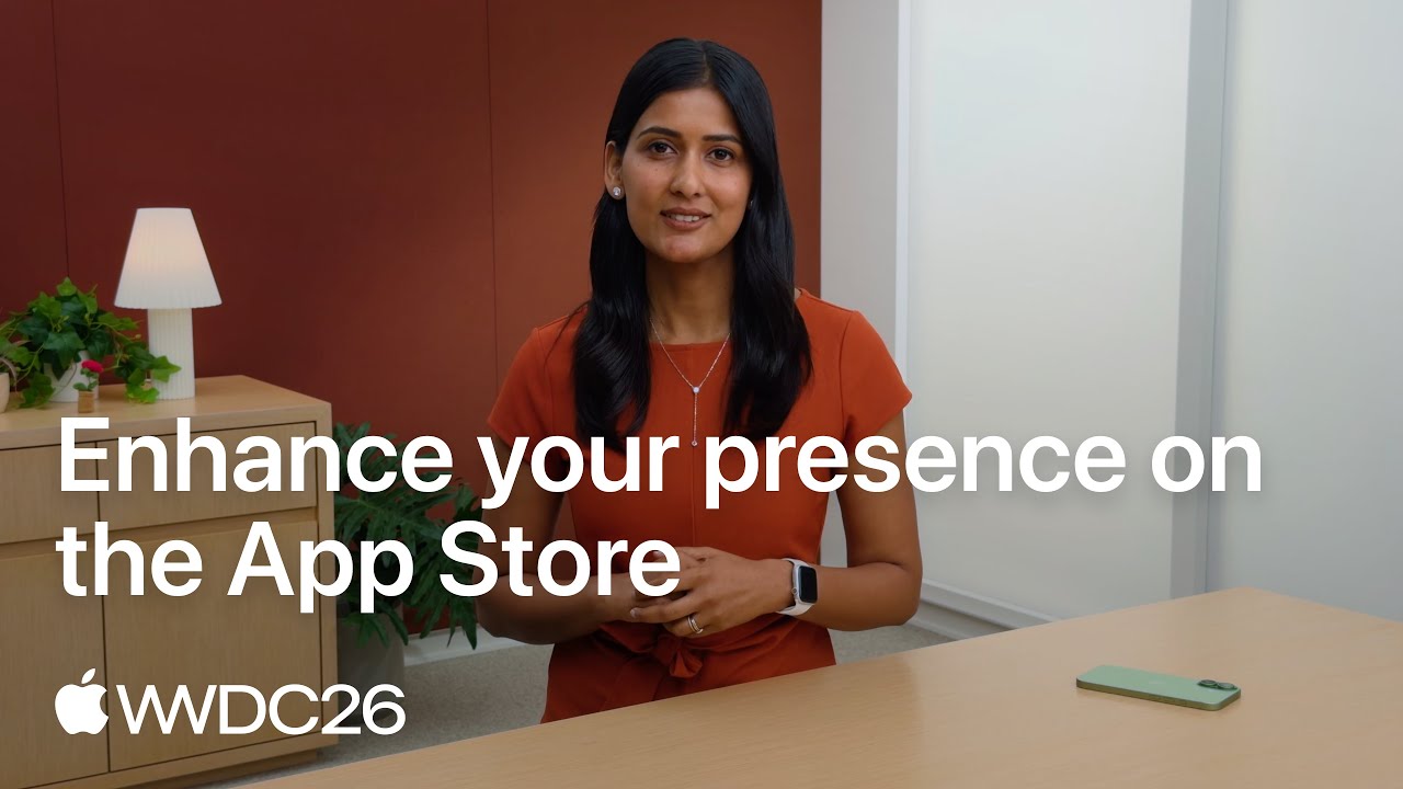
Video: Apple on the Asset Library and Previewing Your Product Page
The upload step above happens in App Store Connect. Apple's WWDC26 session shows where your images now appear across the store, how the Asset Library keeps them in one place and how to preview a product page before it goes live.
App Store Screenshot Generators and Templates: Prices in October 2026
Prices were read on each vendor's own pricing page on October 13, 2026, in US dollars. Monthly and annual billing are labelled, because the gap between them is large. A tool is listed only if its price could be confirmed that day.
| Tool | Free plan | Paid plans | Suits |
|---|---|---|---|
| Xcode Device Hub | Part of Xcode | None | Capturing the raw screens at full resolution |
| Figma, on Figma's pricing page | Starter plan is free | Professional starts at $16 a month for a full seat | Laying out a set by hand with full control |
| fastlane snapshot and frameit | Open source | None | Developers who want captures and frames made by script for every language |
| AppScreens | $0: 1 saved project, up to 5 screens per project, essential sizes | Pro at $25 a month billed monthly, or $99 a year. Scale at $50 a month, or $180 a year | Templates, translation into more than 80 languages and upload to both stores on Pro |
| Screenshots Pro | Basic at $0: the editor, all devices and templates, export in all sizes | Standard at $19 a month. Extended at $49 a month. Annual billing saves 35 percent | A single release on Basic, custom fonts and localization on Standard |
| AppLaunchpad | $0: 10 templates and limited exports | Pro at $15 a month billed monthly, or $10 a month billed annually | Template based sets for both stores with AI translation on Pro |
| Previewed | Lite at $0: 2D exports at 720p with an attribution license | Plus at $9.99 once for 10 larger exports. Pro at $19 a month, billed $228 a year | Device mockups, 3D angles and short promo videos |
Annual sums: AppScreens Pro is $99 a year against 12 times $25, which is $300, on monthly billing. AppLaunchpad Pro is 12 times $10, which is $120, on annual billing against 12 times $15, which is $180. If you make one set per year, a month of any paid plan or a free plan is enough.
App Store Screenshot Mockup and Template Files: Apple's Bezels, PSD and Figma Kits
Searches for an App Store screenshot template in PSD or Figma, or for a free mockup generator, lead back to a few sources. The first two rows are free downloads on Apple Design Resources, read on October 17, 2026. The rules for using Apple's device images are in Apple's marketing guidelines, summed up in the steps above.
| Resource | Formats | What it covers | Use it for |
|---|---|---|---|
| Apple product bezels | Photoshop and PNG | iPhone Duo, iPhone 18, iPhone 17 and iPhone 16, iPad Pro (M5), iPad Air (M4), iPad mini (A17 Pro), iPad (A16), Mac displays and Apple Watch models | The device frame around a capture, if you use one. This is the free answer to an App Store screenshot template in PSD. |
| Apple's iOS 27 and iPadOS 27 UI Kit | Figma and Sketch | System interface parts such as bars, sheets and keyboards | Mocking up a screen before it is built, or adding system elements beside a caption |
| fastlane frameit | Command line, set up in a Framefile.json | Device frames, a background, and a keyword and title above or below each screenshot, with a .strings file per language | Framing and captioning many languages from one configuration |
| Previewed | In the browser | 2D and 3D device mockups and short promo videos | A mockup generator with a $0 plan, priced in the table above |
One catch with frames: frameit's documentation warns that screenshots framed without a title keep a full resolution that cannot be uploaded to the App Store directly. Run every framed file through the App Store screenshot size checker before you upload it.
How to Download App Store Screenshots From Any Listing
People download App Store screenshots for two reasons: to study a set they admire, or to get their own files back when the design source is lost. Both work through Apple's public lookup. Apple's Search API documentation describes a lookup request by ID, and in our test on October 17, 2026, a lookup with an app's numeric ID (the digits after id in its App Store link) returned one list of iPhone screenshot links and a separate list for iPad. For Streaks, described above, that was 10 iPhone images and 9 iPad images.
The links point to small JPEG thumbnails, and the size is written into the end of each address. In our test, replacing 320x480bb.jpg with 1320x2868bb.png returned the full 1320 x 2868 PNG, the size the set was uploaded at. The file names can be telling as well: the Streaks files we fetched were named after the iPhone 18 Pro Max, which shows the device the set was prepared for.
Mind the rights. The screenshots belong to the companies that made them, which is why this page describes sets instead of showing them, and Apple's Search API page says promotional content from the API may be used only to promote store content. Study other sets for their patterns, and reuse only your own files.
Making App Store Screenshots With AI, Claude Code or Codex
AI helps most with the parts of a set that are not the screen. Captions, translations and layout variants are text and arrangement, and a coding agent such as Claude Code or Codex can run the command line tools described above. fastlane's snapshot generates localized screenshots for different devices and languages from UI tests, and frameit adds frames and captions from a configuration file, with one .strings file per language.
The interface itself should stay a real capture. Guideline 2.3.3 of the App Review Guidelines asks for screenshots that show the app in use, and guideline 2.3.1 treats misleading marketing as grounds for removal, so a generated picture of a screen the app does not have is a risk however polished it looks. Let the AI write the caption, the background and the translation, and capture the screen yourself.
An AI made set passes the same checks as one made by hand: accepted pixel sizes and no alpha channel, which the App Store screenshot size checker reads, plus the content rules above. For AI help after the store, Spreadcast's MCP server at spreadcast.app/api/mcp lets Claude or ChatGPT design social posts and carousels from your own icon, screenshots and colors, as described on the MCP page. It does not make App Store screenshots.
Testing App Store Screenshots: Product Page Optimization and Custom Product Pages
Opinions about screenshots are cheap to settle, because the test tool is built into App Store Connect. Apple's product page optimization page describes it: you test up to three alternate versions, called treatments, against your original page, and each can change the app icon, the screenshots and the app previews. You choose what share of traffic sees a treatment. In Apple's example, 40 percent of traffic across two treatments gives each 20 percent and leaves 60 percent on the original. A person sees the same version for the whole test.
The limits matter when you plan. You can run one test at a time, it runs for up to 90 days or until you stop it, and it cannot be changed once started. New screenshots in a treatment go through App Review first, and a test with no alternate icon can be submitted without a new app version. Apple recommends waiting until a treatment is declared better or worse with at least 90 percent confidence before applying it. Apple's help page for these tests adds that the app must be Ready for Distribution, that treatments show on iOS 15 and iPadOS 15 or later, and that tests are not available for custom product pages.
Test one thing at a time, and test the first frame first. A treatment that changes the caption, the background and the order tells you nothing about which change worked. Good first tests, drawn from the patterns above: a proof frame against a product frame in first place, a caption above against a caption below, light against dark, a device frame against none, and a preview video against none.
Custom product pages solve a different problem: different visitors want different things. Apple's custom product pages page says you can publish up to 70, each with its own screenshots, promotional text and app previews and its own URL, that they are reviewed without an app update, and that you can assign keywords so a page appears in search for those terms. Apple reports that developers see an average rise of 2.5 percentage points when they send people to a custom page, against an average conversion rate of 1.6 percent on default pages. Those are Apple's figures and the page gives no date for them.
The developer stories Apple publishes on those two pages are the only screenshot test results here that come with a named source. On the custom product pages page, the game State of Survival matched the screenshots on a custom page to its ads for role playing fans and reports conversion 33 percent higher and cost per install 14 percent lower than the default page. Read them as best cases that Apple chose to show. More of them are written up in our mobile app marketing examples, and the wider numbers on the store are in App Store statistics.
Localizing App Store Screenshots for Other Languages and Countries
Screenshots are localized per language in App Store Connect. Apple's page on localizing app information says a new language starts with the screenshots of your primary language until you upload its own, which is how English captions end up on a French listing. Apple's localization overview puts the store at 175 regions and 50 languages and suggests tailoring screenshots to each market, and its asset guidance asks you to localize any text for every language the app supports. Product page optimization treatments and custom product pages can be localized too.
Three live examples show three depths of localization. Duolingo's German listing, read on October 13, 2026, does not translate the US set. It is a different design: German captions at the top of solid color frames with a German interface underneath, where the US set puts each caption in a block at the bottom. Structured's German listing keeps the design of the US set and translates everything inside it, including the captions, the task names in the phone and the press line. And Citymapper changes content without changing language: the first frame of its US listing lists New York and other North American cities, while its UK listing lists London, Birmingham and Manchester, with London stations and pound prices in the screens behind.
For a small team the order of work is: translate the captions for your largest markets first, then recapture the interface in that language, then swap content (cities, currencies, names, sports) where it changes what a local reader recognizes. Keep captions short in English and they will survive translation into languages that run longer. A panoramic set costs the most to localize, because text placed across a shared image has to be reset for every language.
Google Play Screenshot Rules for Android: What Changes From the App Store
This section is about Android. Everything in it comes from Google's Play Console Help page on preview assets, read on October 13, 2026. Several things that are common in App Store sets are discouraged or ruled out on Google Play, so a Play Store screenshot design is a second set, not a resize.
| Topic | Google Play | Compared with the App Store sets above |
|---|---|---|
| How many | Up to 8 screenshots per device type, and at least 2 to publish | Apple allows up to 10 |
| Large recommendation formats | Apps need at least 4 screenshots at 1080 pixels or more (1080 x 1920 portrait or 1920 x 1080 landscape). Games need at least 3 | No equivalent threshold on the App Store |
| Shape | The long side can be at most twice the short side | A current iPhone screenshot is taller than that, so it cannot be reused as it is |
| Captions | Add taglines only if needed, and keep them to no more than 20 percent of the image | Several first frames above are nearly all text |
| Awards, rankings and reviews | Not in screenshots: nothing that suggests performance, ranking, accolades, awards or user testimonials | A first frame of laurels and review counts would not fit |
| Words to leave out | Best, #1, Top, New, Discount, Sale, Million Downloads, and calls to action such as Download now | Apple rules out prices and unverifiable claims |
| People and hands | Do not show people interacting with the device, such as a finger tapping, unless the app is used off the device | A hand pointing at the next move would not fit |
| Device frames | Device imagery is listed among elements to avoid, since it dates quickly | Most of the App Store sets above show a device |
| Panoramas | Allowed, but put interface first in the first three screenshots | Same caution applies on both stores |
| Localization and alt text | Localize taglines and overlays. Add alt text of 140 characters or fewer to each screenshot | The Apple screenshot pages read for this guide mention no alt text |
Google lists most of these under a heading for recommendation eligibility, so they decide whether your screenshots can be used in the large formats. We did not describe live Google Play listings on this page.
Common App Store Screenshot Mistakes and Rejections
The guideline breaches above are what App Review can reject. These five are the everyday ones. Most pass review and still cost you downloads, and two can stop a submission.
A First Frame That Needs the Second One
Half a phone and half a sentence is what a searcher sees if only one frame is shown. If you build a panorama, give the first frame a complete message, the way Structured and Ivory do.
Captions Written at Design Size
A line that reads well at 1320 pixels wide can vanish in a search result. Nine words in thin type is the usual cause. Cut to six or fewer and set them heavier.
Screens From an Old Version
Section 2.3 asks you to keep screenshots up to date with new versions. A redesign shipped with last year's screenshots misleads buyers and invites a metadata rejection. Recapture in the same release.
The Wrong Size or a Transparent File
A canvas a few pixels off, or a PNG with see through corners, fails at upload. Design at a size from Apple's list and export JPG. The size checker linked above catches both before you reach App Store Connect.
One English Set in Every Country
A new language inherits your primary screenshots. If you localized the description and left the images, the captions are the first thing a shopper sees in the wrong language.
App Store Screenshot Checklist Before You Submit
Go down the list once per language. Every line traces back to a rule or an example on this page.
| Check | Why |
|---|---|
| Frame one says what the app is for in six words or fewer | It may be the only frame a searcher reads |
| Frames one to three each make sense alone | Apple shows one to three in search, depending on orientation |
| Every frame after the first shows the app in use | Guideline 2.3.3 |
| One benefit per frame, caption starts with a verb | The pattern most of the 25 sets follow |
| Captions readable with the row shrunk to phone width | Assets appear at different sizes across the store |
| No prices, discounts, web addresses or copyright symbols | Guideline 2.3.7 and Apple's asset best practices |
| No Android devices, Google Play badges or other store names | Guideline 2.3.10 |
| No Apple recognitions added by hand, no claim you cannot prove | Apple's asset best practices |
| Paid features are marked as paid | Guideline 2.3.2 |
| Sample data is invented, and you hold rights to every photo | Guideline 2.3.9 |
| Content suits a 4+ rating | Guideline 2.3.8 |
| Screens match the version you are submitting | Section 2.3 asks for metadata kept up to date |
| Files are an accepted pixel size, JPG or flattened PNG | Apple's screenshot specifications |
| iPad has its own set if the app runs on iPad | A different shape and a required size |
| Captions translated for each language you support | A new language starts with the primary set |
| Checked in the App Store Connect preview before submitting | It shows how the product page will look before it is live |
For everything else that has to be ready on release day, use the app launch checklist.
Where Spreadcast Fits: Your Screenshots Become Your Social Posts
Before any of that, you can frame the screenshots you already have: paste your App Store link into the free iPhone mockup generator and download every screen in an iPhone, as a transparent PNG, a post or an App Store size. To turn the same screens into a finished store set with a headline on each slide, the free App Store screenshot generator exports them at 1320 x 2868 in one ZIP.
A good screenshot set pays twice. It converts the people who reach your listing, and it is the best picture of your app you own, which makes it the right image for every post that sends people there. Spreadcast is built on that second use. It does not make App Store screenshots. It reads the ones you already published.
Paste your App Store link at the start page and Spreadcast checks your public listing every day, screenshots included. When a new version appears it designs an update post from your release notes and your own screenshot. A new 5 star review becomes a post, and so does a rating milestone. It writes a caption for each network and publishes to Instagram, TikTok, LinkedIn, Facebook, Threads, Pinterest, Bluesky, Mastodon, Telegram and Discord, plus YouTube for video posts, either after one tap of approval or on full autopilot. A post that quotes a reviewer's words always waits for you.
The Free plan covers 1 app and drafts every post for you to download, with a small Spreadcast mark. Pro is $29 a month flat, with design, captions and publishing to all 8 networks included, as shown on the pricing page. It works with apps on the App Store and makes still image posts. For the wider plan around the listing, read how to get app downloads, and for copyable posts see the app update announcement examples.
Frequently Asked Questions
What makes a good App Store screenshot?
It shows the app in use, says one benefit in a few words, and can be read at the small size of a search result. Apple's asset best practices ask for a short phrase that adds to the picture, a clear focal point near the center and your strongest features first. In the 25 sets on this page, captions mostly run three to seven words.
How many screenshots should an app have on the App Store?
Apple requires at least one and allows up to 10 per device size, per its screenshot specifications. The 25 live sets described here average 7.5. Six use all 10 and five use 5, so the number matters less than the first three frames.
How many screenshots show in App Store search results?
Apple's product page guidance says the first one to three appear, depending on their orientation, when no app preview is available. Apple does not give a number per orientation there. A preview video, if you have one, takes the first position.
Can App Store screenshots have text and device frames?
Yes. Guideline 2.3.3 of the App Review Guidelines allows text and image overlays on screenshots that show the app in use, and a device frame is optional. If you use Apple's bezels, follow the product image rules in Apple's marketing guidelines. Google Play is stricter about both.
Is there a free App Store screenshot generator or template?
Yes. Figma's Starter plan is free and works as a template you build once, and fastlane's snapshot and frameit tools are open source. Among dedicated generators, AppScreens, Screenshots Pro, AppLaunchpad and Previewed each listed a $0 plan on October 13, 2026, with limits on projects, templates or export size.
How do I make App Store screenshots in Figma?
Create one frame per screenshot at an accepted size such as 1320 x 2868 pixels, place your captures from Xcode, add a caption in one fixed position and duplicate the frame for each feature. Export JPG, because Figma's PNG files always include an alpha value and Apple does not accept alpha channels.
Can I update App Store screenshots without a new app version?
On the default product page, Apple's help describes uploading screenshots while a version is in a status such as Prepare for Submission and submitting them for review. Two routes need no app update: custom product pages are reviewed independently, and a product page optimization test without an alternate icon can be submitted without a new version.
Do screenshot captions help an app rank in App Store search?
Do not write them for ranking. Apple says search is based on the title, subtitle, keywords, category and user behavior, and that app tags are generated from your metadata. TechCrunch reported in June 2025 that developers should not need to add keywords to screenshots to influence those tags.
How can I download screenshots from an App Store listing?
Use Apple's public lookup with the app's numeric ID, described in Apple's Search API documentation. It returns links to the iPhone and iPad screenshots, and in our test the size written at the end of each link could be raised to the uploaded size. The images belong to their owners, so use other apps' sets for study only.
Can I make App Store screenshots with AI?
Yes, for captions, translations, backgrounds and layout, and an agent can run fastlane to capture and frame the set. Keep the interface a real capture, because guideline 2.3.3 asks screenshots to show the app in use. Then check the files for size and transparency like any other set.
Where These Facts Come From
Every outside number, rule and price on this page links to the page it was taken from.
- Creating your product pageApple Developer
- App Store asset best practices and resourcesApple Developer
- App Review Guidelines, section 2.3 Accurate MetadataApple Developer
- App Store searchApple Developer
- Screenshot specificationsApple Developer, App Store Connect Help
- App preview specificationsApple Developer, App Store Connect Help
- Manage your App Store assetsApple Developer, App Store Connect Help
- Localize app informationApple Developer, App Store Connect Help
- Expanding your app to new marketsApple Developer
- Product page optimization, with developer storiesApple Developer
- Overview of product page optimizationApple Developer, App Store Connect Help
- Custom product pages, with developer storiesApple Developer
- App Store marketing resources and identity guidelinesApple Developer
- Apple design resources: product bezels and UI kitsApple Developer
- Capturing screenshots and videos from devicesApple Developer Documentation
- Add preview assets to showcase your appGoogle Play Console Help
- Figma pricingFigma
- Export formats and settings for static designsFigma Help Center
- snapshot actionfastlane docs
- frameit actionfastlane docs
- AppScreens pricingAppScreens
- Screenshots Pro pricingScreenshots Pro
- AppLaunchpad pricingAppLaunchpad
- Previewed pricingPreviewed
- App Store screenshots: scroll depth study of 1,800 testsSplitMetrics
- The App Store's new AI generated tags are live in the betaTechCrunch
- Notion on the App StoreApp Store
- Airbnb on the App StoreApp Store
- Crouton on the App StoreApp Store
- Callsheet on the App StoreApp Store
- 1Password on the App StoreApp Store
- Duolingo on the App StoreApp Store
- Duolingo on the App Store in GermanyApp Store
- Ivory on the App StoreApp Store
- Structured on the App StoreApp Store
- Structured on the App Store in GermanyApp Store
- YNAB on the App StoreApp Store
- Todoist on the App StoreApp Store
- Calm on the App StoreApp Store
- Gentler Streak on the App StoreApp Store
- (Not Boring) Weather on the App StoreApp Store
- Wise on the App StoreApp Store
- VSCO on the App StoreApp Store
- Photomath on the App StoreApp Store
- Streaks on the App StoreApp Store
- PCalc on the App StoreApp Store
- Copilot Money on the App StoreApp Store
- Flighty on the App StoreApp Store
- Royal Match on the App StoreApp Store
- Balatro on the App StoreApp Store
- Alto's Odyssey on the App StoreApp Store
- Procreate on the App StoreApp Store
- Things 3 for iPad on the App StoreApp Store
- Citymapper on the App Store in the United StatesApp Store
- Citymapper on the App Store in the United KingdomApp Store
- Search API, lookup requestsApple Services Performance Partners
- Video: Enhance your presence on the App Store, WWDC26Apple Developer
Researched and written by Spreadcast. Last checked on October 17, 2026.