Free Instagram Carousel Templates That Fill With Your App
These are six free Instagram carousel templates, each one a carousel an app maker actually posts: a feature tour, an update recap, a review roundup, tips, a problem and its fix, and launch day. Each template is four or five slides in one look, and every slide is 1080 x 1350, the 4:5 portrait shape. Paste your App Store or Google Play link above and press Use My App, and every slide of all six fills with your app at once: its name, icon, colors, store screenshots, feature lines, version, release notes, rating and real five star reviews. Or skip the link and start from the sample app.
Click a carousel and it opens in a design editor on top of the page, with all of its slides in a strip on the left. Change any word, color, font, background, phone or picture, on one slide or on all of them at once. When you are done, download every slide in one ZIP of PNGs, numbered in the order they go in the post, or save the slides one at a time. Each slide carries a small Spreadcast mark in one corner, and there is no account and no email. Want it with no mark? The posts Spreadcast makes for you on the Post Pack or Pro are clean.
Most carousel templates are made for everyone, which means they are made for nobody in particular: a bakery, a coach and a wedding planner all get the same slides. These are only for apps on the App Store and Google Play. The slides have phones for your screens, a What's New card for your version, a rating slide with stars, and quote slides for reviews. That is why one link is enough to fill them.
Spreadcast built this page because a carousel is the first half of what Spreadcast does. Making one carousel by hand is fine. Making one every time you ship, writing a caption for each network and posting it on time is where most app makers stop. If you want that done for you, paste the same link on the start page: Spreadcast finds your app, you continue with it and make a free account, and Spreadcast makes your first 3 posts on the Free plan. The templates on this page stay free either way.
Key Takeaways
Six Carousel Templates for Apps
Feature Tour, Update Recap, Review Roundup, Tips, Problem and Fix, and Launch Day. Four or five slides each, every slide 1080 x 1350.
One Link Fills Every Slide
Your App Store or Google Play link brings in your app's name, icon, colors, up to 3 screenshots, feature lines, version, release notes, rating and real five star reviews.
Nothing Made Up
Reviews are quoted from your listing, never written for you. With no rating yet, the rating slide becomes a review quote instead of a number.
Edit All Slides in One Editor
Every slide sits in a strip on the left. One button gives every slide the same background, accent and fonts; another gives every headline the same font.
Every Slide in One ZIP
Download All Slides saves a ZIP of PNGs in carousel order. Each slide also has its own download link.
Free, With No Sign Up
No account, no email and no AI, with a small Spreadcast mark in the corner of each slide. Pictures you add are read in your browser and never uploaded.
Spreadcast Makes the Next Ones
Paste the same link on the start page and Spreadcast makes posts from your app, including a weekly tips carousel, writes the captions, and on Pro publishes once you approve. The Free plan makes 3 posts, no credit card.
How to Use the Instagram Carousel Templates
Seven steps, all on this page. It works in a desktop browser and on a phone, with nothing to install.
- Step 1
Paste Your App Link
Paste your App Store or Google Play link, or type your app's name, in the field above the carousels and press Use My App. All six carousels fill with your app. Skip this to work with the sample app; Back to the sample app switches back at any time.
- Step 2
Pick a Carousel
Each carousel shows all of its slides in a row, with the number of slides beside its name. Click the one you need and it opens in the editor with every slide loaded.
- Step 3
Replace the Placeholder Lines
Lines only you can write, such as a tip, the problem your app solves or what a feature does for people, are left as plain instructions on the slide. Double click one and type over it.
- Step 4
Check Each Slide
Click a slide in the Pictures strip on the left to move through the carousel. On a phone or a narrow window, use the arrows at the top left of the slide. Read every headline as if it were the only slide someone sees.
- Step 5
Change the Look Once
Click an empty spot so nothing is selected. The right panel now holds the slide's background, fonts and accent color. Change them, then press Apply to All Pictures, which shows your number of slides, such as Apply to All 5 Pictures, to give every slide the same look.
- Step 6
Press Done
Done draws the slides you changed and shows the whole carousel in order. Edit Again goes back into the editor; Pick Another Template starts over with another carousel.
- Step 7
Download All Slides
Download All Slides, such as Download All 5 Slides, saves a ZIP with one PNG per slide, numbered in carousel order, ready to upload to Instagram in that order. The Download Slide link under any slide saves just that one.
Let Spreadcast Make and Post Your Carousels for You
A ZIP of slides is the start of a post. It still needs a caption, a time and someone to upload the slides in the right order on every network you use. For one carousel on Instagram that is fine. For a carousel every week, plus a post for every release, on Instagram, Facebook, LinkedIn, Threads and TikTok, the posting takes longer than the design. Spreadcast does both parts.
Connect your app once and Spreadcast checks your store listing every day. When a new version goes live, it designs the update post with your screens and the changes from your release notes. When your rating crosses a milestone, it makes the rating post. Between releases, a weekly plan fills the gaps with feature, review, tip, problem and season posts. The tips post is a carousel: a cover that names three things to try in your app, then a slide for each of them, in your own colors and fonts. You approve each post with one tap, or switch on full autopilot.
Spreadcast publishes to Instagram, Facebook, LinkedIn, Pinterest, Threads, Bluesky, Mastodon, Telegram, Discord and TikTok, plus YouTube for videos, with a caption written for each network. A carousel goes to every connected network that takes several pictures in one post and skips Pinterest, which takes one picture per post. TikTok copies go to your TikTok drafts by default, so nothing appears on your TikTok feed without you. The Instagram carousel maker page explains how Spreadcast designs and schedules whole carousels, and cross posting covers one post on several networks.
On Pro, carousels you made on this page can go in the same calendar: upload the slides to one post, give it a time, and it goes out on every network you pick. To start, paste your link on the start page. Spreadcast shows the app it found, you continue with it and sign up, and the Free plan makes 3 posts for you to download, with no credit card. A whole carousel counts as one of those posts.
The Free Carousel Templates and Spreadcast Plans
The templates are free with nothing to sign up for. Spreadcast is the product that makes and posts carousels for you. Prices are from the pricing page as of November 15, 2026.
| What you get | Free carousel templates (this page) | Spreadcast Free | Spreadcast Pro |
|---|---|---|---|
| Price | Free | Free | $29 a month, or $290 a year |
| Account | None | Free account | Free account plus the plan |
| Carousel templates and the design editor | Yes, six carousels for apps | Yes | Yes |
| Carousels and posts made from your App Store or Google Play link | No, the templates fill in and you finish them | 3 posts, to download, with a small Spreadcast mark | For new versions worth posting, rating milestones and the weekly plan, with no mark |
| A weekly tips carousel | No | Only in a one time preview of your first week | Yes, in the weekly plan |
| Captions for each network | No | Yes, with the 3 posts | Yes, for every post |
| Mark on the picture | A small Spreadcast mark on each slide | A small Spreadcast mark | None |
| Publishing and scheduling | No, download and post yourself | No | Yes, to Instagram and 9 other networks (plus YouTube for video), on one tap approval or full autopilot |
| Apps and accounts | Any app, nothing saved | 1 app, 10 social accounts (no publishing) | 1 app and 10 social accounts |
For several apps, Studio is $79 a month for 5 apps and 50 social accounts with 3 seats. A Post Pack of 10 posts is $19 and a 30 Day Pass is $39 for people who do not want a subscription. Paid plans can be refunded in full within 7 days.
The Six Instagram Carousel Templates at a Glance
This is how the carousels look with the sample app, before you paste a link. With your link, the same slides fill with your app's name, icon, colors and screens.
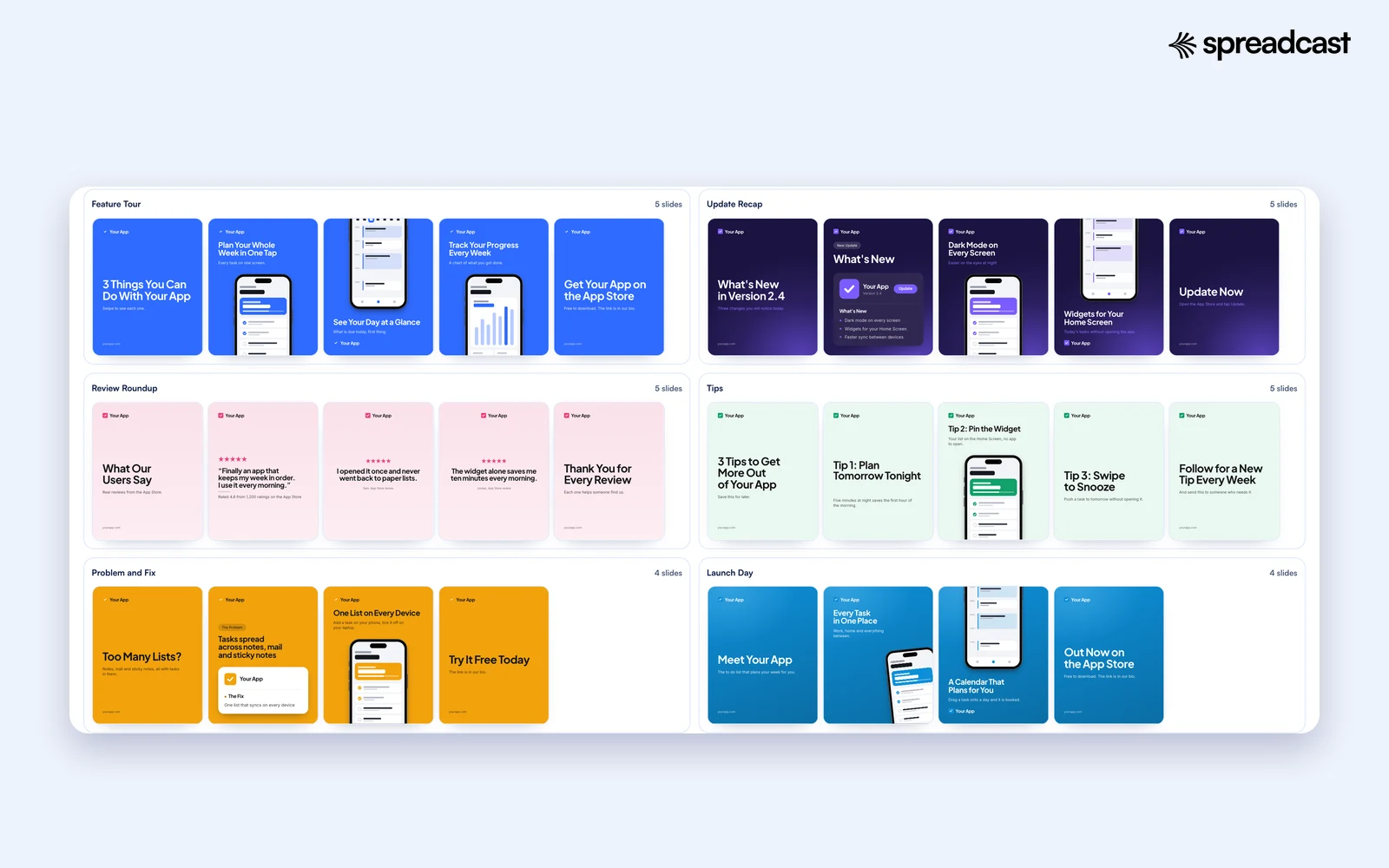
The Six Carousel Templates, Slide by Slide
What each carousel holds and when to post it. With your app link, the slides show your app's details; without one, they show a made up to do app called Your App.
| Carousel | Slides | What the slides show | When to post it |
|---|---|---|---|
| Feature Tour | 5 | A cover that says 3 things you can do with your app, three slides with a screen and one feature each, and a last slide that says where to get the app | Any week, and again whenever a new person might follow you after a launch or a mention |
| Update Recap | 5 | A What's New in Version cover, a What's New card with your icon, version and up to three changes, two slides with a screen for the top two changes, and an Update Now slide | Release day, while the version is new |
| Review Roundup | 5 | A What Our Users Say cover, a rating slide with stars, your rating and one review, two more review quotes, and a thank you slide | When your rating or number of ratings moves, or after a run of good reviews |
| Tips | 5 | A cover with three tips for your app's users, three tips (the middle one with a screen), and a last slide that asks people to follow for a tip every week | Weeks without a release. Tips are what people save |
| Problem and Fix | 4 | A question about the hard way, a card with the problem and your app's fix, the screen where the problem goes away, and where to get the app | When you want new people, not current users, to see why the app exists |
| Launch Day | 4 | A Meet your app cover with your listing's first sentence, two screens with a feature each, and an Out Now slide | Launch day, or the day you arrive on a new store |
Every slide is 1080 x 1350. Each carousel has its own background style. With your link, all six use your app's colors; without it, each has its own sample colors.
What Fills In From Your Store Link, and What Stays for You
When you press Use My App, Spreadcast's server reads your app's public store listing, the same page anyone can open, and fills the slides with what is there. Your app's name is shortened to the part before a colon, so "Todoist: To Do List & Calendar" reads Todoist on a slide. Your icon goes where the logo goes. Your colors are measured from the pixels of your icon and your store screenshots, so the slides look like your app, not like a template site.
Up to three of your store screenshots go into the phones, a different screen in each phone of a carousel where there are enough of them. Feature lines are cut from your description: a bullet like "Smart lists: sort tasks by place and time" becomes Smart lists on the Feature Tour. Your version number goes on the Update Recap cover, and up to three short lines from your release notes become the changes. Your listing's first sentence becomes the line under Meet your app on Launch Day.
Your rating and number of ratings go on the rating slide, and the review slides quote real five star reviews from your listing, word for word, with the reviewer's name as the store shows it. Reviews with links or emoji, very short reviews and complaints are skipped. A long review is cut at the end of a sentence and marked with an ellipsis, never reworded. If your app has no rating yet, the rating slide becomes a review quote instead, so there is never a made up score. If there are not enough reviews, the slide asks you to paste one in.
Some lines only you can write, so they stay as plain instructions on the slide: what a feature does for people, the problem your users had before they found you, and every tip. A store listing does not know your best shortcut or the hidden setting your power users love. Replace those lines first. Then read the filled ones too, because a feature line cut from a description is a starting point, not always the headline you would choose.
Google Play apps work the same way. The slides say Google Play wherever the templates say App Store, the last slides say Get it on Google Play or Out Now on Google Play, and when a Google Play listing shows no version number, the What's New card says Latest version. If the link has no app id in it, or the app cannot be found, the tool says so under the field, and you can keep going with the sample app.
What Each Slide Takes From Your Listing
Where each part of your store listing ends up in the carousels, and what happens when the listing does not have it.
| From your listing | Where it goes | When it is missing |
|---|---|---|
| App name | Covers, last slides, the What's New and problem cards | Always there once the app is found |
| Icon | The logo spot on every slide and the cards | A sample icon in your colors; upload yours with Add > Picture |
| Colors | Background, accent and highlights on all six carousels | Each carousel keeps its own sample colors |
| Screenshots, up to 3 | The phones in Feature Tour, Update Recap, Tips, Problem and Fix, and Launch Day | Drawn sample screens; upload your own into the phone |
| Description | Feature lines on Feature Tour and Launch Day, and the first sentence on Launch Day and Problem and Fix | A placeholder line that tells you what to write |
| Version and release notes | The Update Recap cover, the What's New card and two change slides | What's New in your app, and placeholder changes |
| Rating and number of ratings | The rating slide of Review Roundup | The slide becomes a review quote |
| Five star reviews | Three in all: one on the rating slide and one on each quote slide | A slide that asks you to paste a review word for word |
Nothing is saved to an account; the server keeps the public listing for up to an hour so repeat lookups are fast. The server reads the public page when you press Use My App and sends the details back to your browser.
Instagram Carousel Size: Why Every Slide Is 1080 x 1350
Instagram keeps a photo at its full quality when it is the right shape and width. Its help page on photo resolution says a photo between 320 and 1080 pixels wide keeps its original resolution as long as its aspect ratio is between 1.91:1 and 3:4, which at 1080 pixels wide means a height between 566 and 1440. A wider photo is sized down to 1080, a smaller one is enlarged to 320, and a shape outside that range is cropped.
A carousel adds one rule: every slide has the same shape. Instagram's help page on carousels says the orientation you choose, square, portrait or landscape, applies to all the photos and videos in the post, and you cannot pick a different one for each. Meta's guide to content publishing, which scheduling tools use, says carousel images are all cropped based on the first image, with 1:1 as the default. So if slide one is portrait and slide three is square, slide three gets cropped. Make every slide the same size, as these templates do.
Why 4:5 and not 3:4, the tallest shape Instagram keeps? Because scheduling tools publish through Meta's API, and Meta's media reference for developers accepts images with an aspect ratio between 4:5 and 1.91:1, as JPEG, up to 8 MB. A 3:4 carousel is fine when you post it by hand from your phone, but a scheduler has to crop it first. A 4:5 carousel works both ways, so the same slides can go up today from your phone or next Tuesday from a scheduler.
4:5 is also the shape that takes the most room in the feed among the shapes every route accepts. On a phone, a portrait slide fills more of the screen than a square, and for an app carousel that room goes to your screenshot. Keep words and logos a little away from the left and right edges, as the templates do, because the profile grid shows a slightly trimmed crop of the first slide. The Instagram grid maker shows that crop, and the Instagram post size tool resizes a picture you already have to 4:5.
Instagram Carousel Rules in November 2026
The numbers that decide whether a carousel posts the way you planned. Each row links to the official page it came from, read on November 15, 2026.
| Rule | What Instagram or Meta says | What it means for these templates |
|---|---|---|
| Slides per carousel | Up to 20 photos and videos in one post, per Instagram's carousel page | Four or five slides is plenty for one idea; nothing here comes close to the limit |
| Slides through a publishing tool | Up to 20 images, videos or a mix, per Meta's content publishing guide | Spreadcast's composer takes up to 10 pictures for Instagram |
| One shape for all slides | The orientation you choose affects every photo and video in the post | All six carousels are 1080 x 1350 on every slide |
| The first slide sets the crop | Carousel images are all cropped based on the first image | Never mix a square slide into a portrait carousel |
| Shapes a scheduler can send | 4:5 to 1.91:1, JPEG, 8 MB at most, per Meta's media reference | 4:5 is the tallest shape that every route accepts |
| Captions | One caption for the post, or a caption for each photo or video | Write the main caption first; per slide captions are optional |
| Music | Music can be added to a carousel of photos, but not to carousels with videos, per Instagram's music page | These slides are photos, so music works if you post from the app |
| Alt text | Automatic alt text you can replace with your own, per Instagram's alt text page | Write your own; the automatic one does not read your headline |
| Scheduling in Instagram | Public accounts can schedule photos, Reels and carousels, up to 25 posts a day and up to 30 days ahead, per Instagram's scheduling page | Fine for Instagram alone; other networks need another tool |
| After posting | You can reorder, remove slides and edit captions, but not add new slides | Check the order before you share |
Instagram changes these rules from time to time. Older guides that say 10 slides or square only are out of date.
Inside the Carousel Editor
The editor open on a carousel. Every slide is in the strip on the left, the slide you are working on is in the middle, and its settings are on the right. It is the same editor Spreadcast customers use for the posts Spreadcast makes for them.
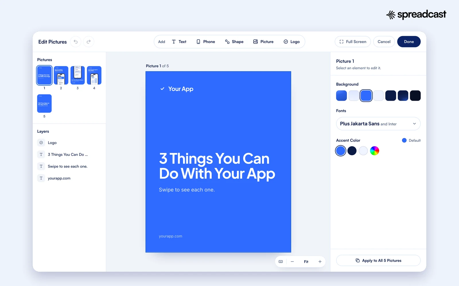
Edit Every Slide of the Carousel in One Editor
A carousel is one design spread over several slides, so the editor opens all of them together. The left panel shows every slide as a small picture under Pictures, and the layers of the slide that is open under Layers. Click a slide to open it. On a phone, the arrows and the slide count at the top left, such as 2 / 5, step through. The small pictures follow your changes as you make them, so you can see the whole carousel while you work on one slide.
The top bar adds things to the open slide: Text, Phone, Shape, Picture and Logo. Select anything to change it in the right panel. Text has its font, size, weight, color, line height, letter spacing, all caps and a highlight for chosen words. A phone can be an iPhone, an Android phone, a Mac window or a MacBook, with your screenshot inside. Shapes come as squares, rounded boxes, circles, pills, outlines and lines, with opacity and corners. Pictures can be replaced and tinted.
Click an empty spot of the slide and the right panel holds the look of the whole slide: the background, the font pairing and the accent color. Under it is one button, Apply to All Pictures, which gives every slide of the carousel that same background, fonts and accent. Select a headline and you get a second one, Apply Font to All Headlines, which gives every headline in the carousel the same type and leaves each slide's colors and sizes alone. Those two buttons are what keep a carousel looking like one post instead of five.
Undo and redo work across slides: undo after editing slide four, then slide two, and it steps back through both in the order you made the changes. Layers can be reordered and locked, so you can lock the background and the phone while you fix the words. Guides appear when an edge or a center lines up with another element or with the middle of the slide. Zoom has Fit to Screen and steps from 50 to 200 percent, Full Screen gives the editor the whole window, and the keyboard button next to the zoom lists every shortcut.
Your work is kept in this browser while you edit. A reload, a closed tab or a crash brings your changes back when you open the same carousel again. Done draws the final slides; download them before you reload, because Done lets the kept copy go. Cancel throws the changes away.
Everything You Can Change on a Slide
The editor has the add bar at the top, slides and layers on the left, and settings on the right. With nothing selected, the right panel holds the look of the whole slide.
| Part | What you can do | Good to know |
|---|---|---|
| Text | Add a headline, a subline or small text. Change the words, font, size, weight, color, line height, letter spacing, alignment and all caps | Select a word or two and highlight them in the accent color, the way the templates light up a feature name |
| Phone | Add a phone, upload a screenshot into it, choose iPhone, Android, a Mac window or a MacBook, resize it | A store screenshot goes in whole as a card. Upload a plain screen capture and it sits inside the phone frame |
| Shapes | Squares, rounded boxes, circles, pills, outlines and lines in any color, with opacity and corners | A pill behind one word makes a tag, such as New or Tip 2 |
| Pictures | Add any picture from your computer or phone, replace it, tint it | This is also how your own logo goes on a slide |
| Logo | With your app link it is your app icon. Without one, the sample logo can be moved or deleted, and your own uploaded as a Picture | A small logo in a corner of each slide is enough |
| Slide look | Background, font pairing and accent color for the open slide | Apply to All Pictures gives every slide the same look |
| Headline font | Font, weight, caps, spacing and line height of a headline | Apply Font to All Headlines does the same for every headline in the carousel |
| Layers | Reorder, bring forward, send backward, lock and unlock | Lock the background while you move the words |
| Slides | Move between slides in the strip, or with the arrows at the top left on a phone | The order in the strip is the order of the download |
| History and view | Undo, redo, zoom in and out, fit to screen, full screen | Undo reaches every slide you changed, in order |
Done draws the slides you changed. Edit Again goes back into the same carousel; Pick Another Template starts over.
Keyboard Shortcuts in the Carousel Editor
The same keys as most design tools. On Windows, use Ctrl where the table says ⌘. The list is also in the editor, behind the keyboard button next to the zoom.
| Action | Keys |
|---|---|
| Undo | ⌘ Z |
| Redo | ⌘ ⇧ Z |
| Duplicate | ⌘ D |
| Copy and paste | ⌘ C, then ⌘ V |
| Delete | ⌫ |
| Nudge by one pixel | Arrow keys |
| Nudge by ten pixels | ⇧ with the arrow keys |
| Send backward, bring forward | ⌘ [ and ⌘ ] |
| Edit text | Double click |
| Deselect | Esc |
| Zoom | ⌘ with the scroll wheel |
| Fit to screen | ⌘ 0 |
On a phone, tap to select, drag to move, and use the panel under the slide for everything else.
How to Build a Carousel Slide by Slide
A carousel has three jobs, and each belongs to a different slide. The first slide makes people swipe. The middle slides deliver what the first one promised. The last slide tells people what to do next. Every template on this page follows that order, and it is worth keeping when you change the words.
The first slide is the only one most people see, because it is what shows in the feed and on your profile grid. Give it a headline that promises something specific and countable: 3 things you can do with your app, what's new in version 2.4, 3 tips for your users. A number tells people how long the swipe will take, and a specific promise tells them why it is worth it. A cover that just says your app's name asks people to swipe for no reason.
Each middle slide says one thing. One feature, one change, one review, one tip. If a slide needs two headlines, it is two slides. Keep the same layout from slide to slide, with the headline in the same place and the phone in the same place, so people read the new words instead of finding them. The templates switch between a phone under the words and a phone above them to keep the eye moving, but the type and colors stay the same.
The last slide is for the ask, and one ask is enough: where to get the app, follow for the next tip, or update now. Instagram counts a carousel as one post, with likes and comments on the whole post rather than on each slide, as its carousel help page explains, so the last slide is your one chance to point people somewhere. Since links in posts are not clickable, the templates say the link is in your bio.
Keep the words short. A 2008 study by Jakob Nielsen found that people read at most 28 percent of the words on an average web page, and 20 percent is more likely. A slide gets less attention than a page someone chose to open. If you cannot read a slide's headline in the time it takes to swipe past it, cut it.
Video: Three Tips for Carousels People Swipe Through
Later's video on what makes a carousel hold attention. It is short and matches the structure of the templates here.

Instagram Carousel Ideas for App Makers
IG carousel ideas that fit an app account, each with the template to start from. Most of them can be repeated with a new feature, review or tip every time.
Three Things Your App Does
Feature Tour with your three most useful features, one screen each. Post it whenever new people are likely to find you, such as after a launch, a feature or a mention.
Everything in the New Version
Update Recap on release day. Our app update announcement examples show how other apps word their changes.
What People Say in Reviews
Review Roundup with three reviews that each name a different benefit. Specific reviews make better slides than reviews that only say great app.
Three Tips Most Users Miss
Tips with a gesture, a setting and a widget. Good tips come from your support inbox: any question asked twice is a slide.
The Problem Before Your App
Problem and Fix written in your users' words. It speaks to people who have never heard of your app.
Launch Day
Launch Day with your listing's first sentence and two screens. Our app launch announcement examples collect how other apps announced theirs.
Before and After a Redesign
Feature Tour with the old screen and the new one on alternating slides. Change the headlines to say what moved and why.
A Walk Through One Flow
Feature Tour with each slide showing the next step of one task, such as setting up an account or making a first project.
Your Rating Milestone
Review Roundup when your rating or number of ratings crosses a round number. Thank the people who rated on the last slide.
A Season or Holiday
Tips with three ways your app helps at that time of year: planning a trip, a budget for January, a routine for the school year.
Feature Tour: Show Three Screens That Sell the App
The Feature Tour is the carousel to post when you want someone who has never used your app to understand it in five swipes. The cover promises three things, each middle slide shows one of them on a real screen, and the last slide says where to get the app. With your link, the cover says 3 Things You Can Do With your app's name, and the three middle slides hold your first three store screenshots and three feature lines from your description.
Pick the three features a new user would care about first, not the three you are proudest of. A sync engine you spent a year on is a feature for you; seeing every task on one screen is a feature for them. Your reviews tell you which is which, because people name the things they love. Then match each screen to its headline. If the headline says plan your week in one tap, the phone shows the week view, not the settings page.
Write each headline as what the user can now do, starting with a verb if you can: plan, track, find, share, save. Keep it to four to eight words and put the detail in the line under it. The templates leave that line as a placeholder that says what to write, because a description rarely has a one line answer to what a feature does for people. Replace it with the benefit in plain words.
Use real screens with believable data: real looking names, a few finished tasks, a full status bar. Apple's marketing guidelines ask apps to show the app as it appears when it runs, with fictional account information instead of a real person's data, and with promotional copy beside the device rather than on top of it. The templates keep the words above or below the phone for that reason. For a set of App Store screenshots with the same kind of headlines, use the App Store screenshot generator, and for one framed screen as a transparent PNG, the iPhone mockup generator.
Update Recap: Turn Your Release Notes Into Slides
An update is the easiest thing an app maker has to post about. The work is done, the release notes are written, and the people who follow you want to know the app is alive. The Update Recap carousel turns the notes into five slides: a cover with your version number, a What's New card with your icon and up to three changes, two slides that show the top two changes on a screen, and an Update Now slide that says to open the App Store or Google Play and tap Update.
With your link, the version and the changes come straight from your listing. The changes are short lines from your release notes, between 8 and 60 characters each, with emoji lines skipped. If your notes are one long paragraph or only say bug fixes and improvements, the card will have little to show. That is a sign to write better notes, not to make the carousel anyway. Dark mode on every screen is a change people notice. Fixed a race condition in the sync service is not.
Put the change people will notice first on slide three, with the screen that shows it. The second change gets slide four. If one change matters far more than the rest, give it a single post of its own a few days later with the Instagram post maker, which has an App Update template and a New Feature template with a phone.
Release notes are worth writing well for this reason alone: they become your posts. The free release notes generator turns a list of changes into notes users read, and our release notes examples show the difference between notes people skip and notes people quote.
Review Roundup: Real Words Only
Reviews are the most convincing thing an app can post, because they are not you talking. The Review Roundup puts three of them in one carousel: a rating slide with your stars, your rating, your number of ratings and one review, then two slides with a review each in large type, then a thank you. With your link, all three reviews are real five star reviews from your listing, quoted word for word, with the name the store shows.
Keep it that way. On August 14, 2024, the US Federal Trade Commission announced a final rule banning fake reviews and testimonials, including reviews made with AI and reviews from company insiders that hide the connection. Writing a glowing review yourself and putting it on a slide is exactly what the rule is about. If you shorten a review, cut it at the end of a sentence and never change what it says. The tool does the same: a long review is cut where a sentence ends and marked with an ellipsis.
Keep the numbers exact too. If your listing shows 4.7 from 1,240 ratings, the slide says 4.7 and 1,240, not almost 5 stars. Ratings differ by country on the App Store, so use the storefront most of your followers see, or say which country it is in the caption. If your app has no rating yet, the tool turns the rating slide into a review quote instead of showing a number it does not have.
Choose reviews that name something. Saved me an hour every Monday, or finally a budget app my partner and I both use, gives a stranger a reason to try the app. Love it, five stars gives them nothing. If your listing does not have three specific reviews yet, our guide on how to get App Store reviews covers how to ask without annoying anyone, and the testimonial graphic generator makes a single review post when one is all you have.
Tips and Problem and Fix: Carousels for the Weeks Without a Release
Most weeks, nothing ships, and those are the weeks when an app account goes quiet. The Tips and Problem and Fix carousels are for those weeks. Neither needs a new version, a milestone or a new screenshot. Tips teach your current users something; Problem and Fix shows new people why your app exists.
The Tips carousel has a cover with three tips for your app's users and a line that says to save it for later, then one tip per slide, then a slide that asks people to follow for a tip every week. Every tip line is a placeholder, because only you know them. Write each as an instruction, such as swipe left on a task to move it to tomorrow, put the how in the line under it, and use the middle slide's phone to show where to tap. Tips are the kind of post people save to find again.
Problem and Fix is four slides. The cover asks whether people are still doing it the hard way, with a line where you name the problem in your users' own words. The second slide sets the problem against your app's fix on a card. The third shows the screen where the problem goes away, with your listing's first sentence under it. The last slide says where to get the app. It is the kind of carousel someone sends to a friend with the same problem.
Keep both honest. A tip has to work exactly as written in the current version, and a fix has to be something the app does today, not a feature on the roadmap. People try what they see on a post, and a tip that does not work costs you more trust than the carousel gained. Our list of app promotion ideas has more topics for quiet weeks, and ChatGPT prompts for Instagram carousels can help you draft the words before you put them on the slides.
Launch Day: A Carousel for a New App
A new app gets one launch day, and the carousel for it should say what the app is in four slides. The cover says Meet and your app's name, with your listing's first sentence under it. Two slides show your first screens with a feature each, the first with a tilted phone. The last slide says Out Now on the App Store or Google Play and that the link is in your bio.
Make it before launch day, not on it. Launch day is full of store review surprises, replies and fixes, and the posts are the first thing to slip. Make the Launch Day and Feature Tour carousels the week before, keep the ZIPs in one folder, and post them as the week goes: Launch Day on the day, Feature Tour two days later, Problem and Fix at the end of the week. Our app launch checklist lists everything else worth preparing, and the product launch post generator designs a single launch post from your listing.
Why Carousels Work: What the Data Says
Instagram ranks posts by what it predicts people will do with them. In its explanation of ranking, Instagram says the five interactions it looks at most closely in Feed are how likely you are to spend a few seconds on a post, comment on it, like it, share it and tap on the profile photo, and it looks at how quickly people are liking, commenting, sharing and saving a post. A carousel asks people to spend those seconds, one swipe at a time.
Buffer's analysis of content formats, published in March 2026, put the median engagement rate of Instagram carousels at 6.9 percent of reach, the highest of any format on the platform, against 4.4 percent for single images and 3.3 percent for Reels. The same article says Reels reached about 1.36 times as many people as carousels in a separate study of more than 4 million posts published through Buffer. So Reels bring more people in, and carousels get more out of the people who see them.
Socialinsider's Instagram benchmarks, from 67,541,436 posts by business accounts, measure engagement by followers instead, and also put carousels first: 0.55 percent for carousels in 2025, 0.52 percent for Reels and 0.37 percent for images. The same page says brands published 8 Reels, 7 images and 5 carousels a month on Instagram in 2025, so carousels were the format brands posted least.
Small tests point the same way. Hootsuite's social team ran six carousels against six Reels with similar content on one account over three weeks in 2023. The carousels got 220 likes to the Reels' 126, 16 shares to 5, 11 saves to 2 and a reach of 2,316 to 2,052, while the Reels got more comments, 20 to 16. The author is clear that it was one account selling vintage decor, and that the answer depends on the content and the audience.
Treat all of these as averages across every kind of account, not as a promise for yours. For an app, the practical answer is simple. A single post is right when there is one thing to say. A carousel is right when there are several things that belong together: three features, three changes, three reviews, three tips. And Reels are worth making too, because they reach people who do not follow you yet. Our piece on why an app feed looks like a slideshow is about mixing the formats.
Video: Carousels Against Reels, Tested
Hootsuite's social team runs the small carousels against Reels test described above and ends with tips for carousels. Useful for deciding how often to post each format.

Instagram Carousel Designs That Look Like Your App
A carousel should look like it came from your app, not from a template site. The quickest way there is color. With your link, the templates take colors measured from your icon and store screenshots. Without it, open your app, look at the color of your main button or your icon, and set it as the accent on one slide. Then press Apply to All Pictures and every slide follows.
Font pairings come in twos: one font for the headlines and one for everything else. A bold sans serif headline with a plain body font suits most apps. A serif headline suits apps about reading, writing, food or calm. Whatever you choose, keep it on every slide and every carousel you post, because a feed in one type looks like a brand and a feed in six looks like six accounts.
Check that every slide can be read. The WCAG guidance on contrast asks for a contrast ratio of at least 4.5:1 for normal text and 3:1 for large text. A slide is not a web page, but the same eyes read it, often on a phone in sunlight. White on pale yellow or gray on gray fails both. If you squint at a slide and the headline disappears, change the background, not the font size.
Use the highlight sparingly. The templates light up one or two words of a headline in the accent color, such as the version number or the feature name. That points the eye at the part that matters. Highlighting half the headline points it nowhere. If you have not settled on brand colors and fonts yet, the free brand kit generator pulls them from your website, and our guide to brand consistency without a design team covers which pieces matter on social.
Common Instagram Carousel Mistakes
A Cover With No Reason to Swipe
A first slide that only says your app's name. Promise something specific and countable instead, such as 3 tips or what's new in a version.
Mixed Slide Shapes
One square slide in a portrait carousel gets cropped, because every slide takes the first slide's shape. Keep all slides 1080 x 1350.
Too Many Words on a Slide
A paragraph on a slide is not read. One headline and one short line per slide; the rest goes in the caption.
A Different Look on Every Slide
Slides that change fonts and colors look like five posts. Set the look once and use Apply to All Pictures.
Slides in the Wrong Order
Instagram lets you reorder after posting, but not add slides. Upload in the order of the file numbers and check before you share.
A Blurry Screenshot
A small screenshot stretched to fill the phone. Upload the original capture from the device or simulator, not a copy from a chat.
A Made Up Review
Inventing or rewording a review is what the FTC rule on fake reviews is about. Quote real ones, word for word.
No Ask on the Last Slide
The last slide is the only place to say what to do next. Pick one: get the app, follow, or update now.
Captions, Alt Text and Music for a Carousel
The slides stop the scroll, and the caption does the rest. Start the caption with the point of the carousel in one sentence, because Instagram cuts a long caption short behind a more link. Then add what the slides do not say: why the change matters, who the tip is for, what the review was about. End with a short line that the link is in your bio. Instagram also lets you give each slide its own caption, but one good caption for the whole post is enough for most app carousels.
Write alt text for every slide. Instagram describes photos with automatic alt text made by object recognition, which can say a phone is in the picture but not what your headline says. Replace it with your own before you share, under More options and Write alt text, or later with Edit alt text. For a slide, describe what it shows in plain words: a phone showing the weekly planner, with the headline plan your whole week in one tap.
Music works on these carousels if you post from the Instagram app. Instagram's page on music in carousels says you can add music to a carousel of photos, but not to a carousel with videos. The slides here are all pictures, so the Add music step will be there. A scheduler that posts through Meta's API may not offer music, so post from the app when the song matters.
If writing captions for every network is the part you put off, the free social media caption generator writes them, and the Instagram hashtag generator picks a few specific hashtags for a post. Spreadcast writes a caption for each network with every post it makes for you.
Free Instagram Carousel Templates Compared
We read each tool's own carousel or Instagram template page on November 15, 2026, and only state what those pages say. Spreadcast is first because it is built around app carousels, needs no account at all to edit and download, and can go on to make the carousels for you and publish them. Sources: Canva, Adobe Express, Visme, PosterMyWall, Kittl, Simplified, PostNitro and aiCarousels.
| Tool | To start | Carousel templates | Posting and scheduling | Stands out for |
|---|---|---|---|---|
| Spreadcast | No account to edit and download | Six made for app makers, 4 or 5 slides each, every slide 1080 x 1350 | Spreadcast designs carousels from your app and publishes them; Pro at $29 a month includes captions and publishing to 11 networks, carousels to the 9 that take several pictures | Slides filled from your App Store or Google Play link, real reviews word for word, and clean carousels made for you on the Post Pack or Pro |
| Canva | Not stated on its carousel template page | Free templates for carousel designs; the ones listed run 4 to 8 slides, for Instagram and LinkedIn | Not stated on that page | Carousels for tips, photo diaries, scrapbooks and course promotions |
| Adobe Express | Free to use, no credit card required | Thousands of templates; any Instagram post becomes a carousel with its multiple page feature | A Content Scheduler for posts | A full design suite with a free plan |
| Visme | A Sign Up Free button on the page | About 50 Instagram carousel post templates listed | Upload to Instagram yourself, as with any carousel | Downloads a carousel as multiple image files |
| PosterMyWall | Free users connect one social account | Thousands of templates; carousels supported | Free users publish right away to one account; scheduling is part of Premium | Schedules feed posts, carousels, Stories and Reels on Premium |
| Kittl | Not stated on its template page | Free Instagram post templates; a carousel of tips is named as a use | Not described on that page | Swap colors, add your logo or remix fonts |
| Simplified | Free AI carousel maker, unlimited carousels per its FAQ | A template library or a blank canvas | Scheduling is a separate post scheduler product | AI writing, PNG or PDF export |
| PostNitro | Free to start, no credit card | 100+ templates, all 4:5 | Publishing and scheduling from Creator+ at $30 a month | An AI agent beside the canvas, PNG, PDF and MP4 export |
| aiCarousels | Free to start, no sign up | 304 layouts and 19 AI writing voices | Posting to LinkedIn personal profiles | AI written slides; downloading needs Pro or Team |
Canva's pages refuse plain automated fetches, so we read its template page in a browser. Vendors change plans and templates often, so check each site before you rely on a limit. Nothing here is sponsored.
When Another Carousel Template Tool Is the Better Pick
This page does one job: carousels for apps, in one size, from six templates. If you need carousels for a café, a course, a wedding or a webinar, the big libraries in Canva, Adobe Express, Visme or PosterMyWall give you far more to start from. If you want a tool to write a carousel from a topic or an article, Simplified, PostNitro and aiCarousels are built around that, and this page does not write anything.
The same goes for teams that already live in one design tool. If your designer keeps every brand asset in a shared workspace, keep making carousels there. Our Canva comparison, Adobe Express comparison and the roundup of the best Canva alternatives go through what each tool is good at. For the AI carousel tools, see our Simplified comparison and Predis.ai comparison.
Where this page is the better pick is the carousel an app maker needs today: your real screens in phones, your version and your reviews on the slides, in the right size, without signing up for anything. And where Spreadcast is the better pick is the step after that: making those carousels and posts every week from your real app, writing the captions and getting them published, which none of the template tool pages above say they do from an App Store or Google Play listing.
Post the Same Carousel on LinkedIn, TikTok and Threads
A carousel made for Instagram works on most other networks too, because most of them take several pictures in one post and show portrait pictures well. The slides you download here are plain PNGs, so you can upload the same set to Facebook, LinkedIn, Threads, TikTok as a photo post, Telegram or Discord. The limits differ, and two of them matter for a five slide carousel.
Bluesky and Mastodon take four pictures per post, so a five slide carousel needs one slide dropped there, usually the last one. Pinterest takes one picture per pin, so post the cover alone, or one strong slide, with a link to your app. YouTube takes videos only. Spreadcast's composer checks this for you: when a post has more pictures than a network takes, it says so before anything goes out.
LinkedIn deserves a note of its own, because LinkedIn carousels are usually PDF documents rather than picture posts. A set of pictures works on LinkedIn too, and with the same 4:5 slides. If you want the document style, our LinkedIn carousel size guide covers the sizes, and the LinkedIn carousel examples show what works there. For TikTok, the TikTok slideshow maker explains photo posts.
Where a Five Slide Carousel Fits
How many pictures each network takes in one post when Spreadcast publishes it, from Spreadcast's own posting rules, and what that means for a carousel from this page.
| Network | Pictures in one post | A five slide carousel |
|---|---|---|
| 10 | Posts whole | |
| 10 | Posts whole | |
| 9 | Posts whole | |
| Threads | 10 | Posts whole |
| TikTok | 10, as a photo post | Posts whole; goes to your TikTok drafts by default |
| Telegram | 10 | Posts whole, as an album |
| Discord | 10 | Posts whole |
| Bluesky | 4 | Drop one slide |
| Mastodon | 4 on most servers | Drop one slide |
| 1 | Post the cover or one slide on its own | |
| YouTube | Videos only | Not for a picture carousel |
Instagram itself takes up to 20; Spreadcast's composer keeps 10, which is more than any of these carousels need.
Google Play and Android Apps
Everything on this page works for Android apps. Paste your Google Play link and the slides name Google Play instead of the App Store, the last slides point to Google Play, and the What's New card says Latest version when the listing gives no version number. To show an Android phone instead of an iPhone, select the phone, choose Android, and upload a screenshot from your phone or the emulator.
If you reuse these slides in your Play listing, mind Google's own rules for store graphics, which are stricter than Instagram's. Google's page on preview assets lists device imagery among the things to avoid in store screenshots, says taglines should not take up more than 20 percent of the image, and asks for no calls to action such as Download now. A social post can say more than a store screenshot, but the same restraint reads well on Instagram too.
For the store side of an Android app, our guides on Google Play screenshot sizes and how to promote an Android app go into detail. Spreadcast reads Google Play links the same way it reads App Store links, here and in the product.
Is There AI in These Carousel Templates?
No. Nothing on this page runs AI. When you paste your link, plain code reads your public store listing and places what is there: your app's name, icon, screenshots, feature lines cut from your description by simple rules, version, release note lines, rating and five star reviews word for word, and colors measured from the pixels of your icon and screenshots. The headlines are fixed patterns such as 3 Things You Can Do With and your app's name, and the lines that need your judgment are left as placeholders. That keeps the tool free for everyone, and the slides say only what your listing and you say.
Spreadcast itself does use AI, and that part starts with a free account. After you continue with your app on the start page and sign up, Spreadcast reads your listing, your real screenshots, icon, brand colors and fonts, and makes posts already filled in: headlines and captions written from your release notes, features and reviews, a caption for each network, and carousels of 3 to 8 slides when you ask for one. The Free plan makes 3 posts for you to download with a small Spreadcast mark, so you can judge them before you pay. Pro also lets you create and post from Claude or ChatGPT through Spreadcast's MCP connection.
The difference from a prompt based carousel generator is where the content comes from. A prompt tool writes slides from a sentence, and it has never seen your app. Spreadcast starts from your listing, so the phones show your actual screens and the update carousel lists the changes you actually shipped. Read the words before anything goes out either way. That is why Spreadcast asks for your one tap approval by default, and why this page leaves the words to you.
Privacy: What Happens to Your Pictures
Screenshots, logos and photos you add to a slide are opened by your browser with its built in FileReader and drawn on your own screen. They are not uploaded to Spreadcast or anywhere else. That matters when you are making a carousel for a feature that has not shipped yet, or for an app that is still a secret.
Your work in progress is kept in this browser's own storage, called IndexedDB, so a reload, a closed tab or a crash does not lose it. Open the same carousel again and your changes come back. Done or Cancel lets the kept copy go, and anything left is cleared after a week. It never leaves your device, and nobody else can see it.
If you paste an App Store or Google Play link, Spreadcast's server reads that app's public store listing and sends back the name, icon, screenshots, version, rating and reviews for the slides. There is no account on this page, so there is nothing to delete afterwards and no email to unsubscribe from. To keep the tool fair for everyone, one visitor can load 20 apps in ten minutes.
A Month of Carousels From Six Templates
One way to post a carousel every week for four weeks using only the templates on this page, around a release in the first week. Move the rows around your own dates.
| Week | Carousel | Why this one | Pair it with |
|---|---|---|---|
| Week 1, release week | Update Recap on release day | The version is new and the notes are fresh | A single post on the biggest change, three days later, from the Instagram post maker |
| Week 2 | Tips about the new version | Current users learn to use what changed | A Reel showing one tip in action |
| Week 3 | Review Roundup | Reviews after an update often name the new thing | Replies to those reviews in App Store Connect or the Play Console |
| Week 4 | Problem and Fix or Feature Tour | Speaks to people who do not use the app yet | A story pointing to the link in your bio |
One carousel a week is a pace most app makers can keep by hand. Spreadcast's weekly plan makes posts like these for you, including a tips carousel, at the posting times you choose.
Who Uses These Carousel Templates
Indie Developers
One person shipping an app, with no designer and no time for a design tool. See how indie developers use Spreadcast after launch.
Mobile App Teams
A release every two weeks and a feed that should keep up. More on Spreadcast for mobile apps.
App Startups
Launch week, the first ratings, the first press. Each is a carousel. See Spreadcast for startups.
Studios and Agencies
Several client apps, each with its own colors and fonts. Spreadcast keeps each app's brand separate.
AI App Builders
New features every week and screens that change as fast. See Spreadcast for AI apps.
SaaS Teams With a Mobile App
The companion app deserves its own carousels. More on SaaS apps.
How the Templates Draw Your Slides
Every slide is a set of separate pieces on a 1080 x 1350 canvas: the background, each text, the phone with its screen, the icon and any shapes, laid out by Spreadcast's own post layouts. That is why you can click any part of any slide and change it. All slides of a carousel share one look, so they read as one post, and Download draws each slide to a PNG at full size in your browser.
For more about promoting an app on Instagram, from the bio to Reels, read our guide on how to promote an app on Instagram, and for what makes a picture people stop for, what makes a social creative convert.
Frequently Asked Questions
Are these Instagram carousel templates really free?
Yes. All six carousels, the whole editor and the downloads are free, with a small Spreadcast mark on each slide and no limit on how many you make. Posts Spreadcast makes for you on the Post Pack ($19 for 10) or Pro carry no mark. Spreadcast pays for it with the paid plans of its posting product.
Do I need to sign up?
No. Pick a carousel, edit it and download the slides. There is no account, no email and no login. An account is only needed if you want Spreadcast to make posts from your app, write captions or publish for you.
What size are the slides?
1080 x 1350 pixels, the 4:5 portrait shape, on every slide. Instagram shows it whole, and scheduling tools can publish it as it is.
How many slides can an Instagram carousel have?
Instagram allows up to 20 photos and videos in one carousel. These templates have four or five slides, which is enough for one idea.
How do I upload the slides in the right order?
Unzip the download and select the files in their number order in Instagram. The numbers match the order in the editor.
Can I use them for an Android app?
Yes. Paste your Google Play link and the slides name Google Play. Switch any phone to Android in the editor.
Does this page use AI?
No. It reads your public store listing with plain code and leaves the words that need judgment to you. The AI part of Spreadcast starts with a free account.
Can it post the carousel for me?
Not from this page. Download the slides and post them, or schedule them in Instagram. Spreadcast Pro publishes carousels to Instagram and other networks for $29 a month.
Where These Facts Come From
Every outside number, rule and price on this page links to the page it was taken from.
- Share a post with multiple photos or videos on InstagramInstagram Help Center
- Image resolution of photos you share on InstagramInstagram Help Center
- Add music to a post with multiple photos on InstagramInstagram Help Center
- Edit the alternative text for a post on InstagramInstagram Help Center
- Create and manage scheduled posts and Reels on InstagramInstagram Help Center
- Instagram Platform: content publishingMeta for Developers
- Instagram Graph API: IG User Media referenceMeta for Developers
- Instagram Ranking ExplainedInstagram
- The best content format on social media, 2026 dataBuffer
- Instagram benchmarksSocialinsider
- Experiment: Instagram carousels vs ReelsHootsuite
- How little do users read?Nielsen Norman Group
- Marketing Resources and Identity GuidelinesApple Developer
- Add preview assets to showcase your appPlay Console Help
- Final rule banning fake reviews and testimonials, August 2024Federal Trade Commission
- Understanding contrast (minimum)W3C
- FileReaderMDN Web Docs
- IndexedDB APIMDN Web Docs
- Carousel templatesCanva
- Instagram post makerAdobe Express
- Instagram carousel post templatesVisme
- Instagram schedulerPosterMyWall
- Instagram post templatesKittl
- AI carousel generatorSimplified
- AI carousel makerPostNitro
- AI carousel generatoraiCarousels
- 3 easy tips to create engaging Instagram carouselsLater on YouTube
- Instagram Reels vs carousels experimentHootsuite Labs on YouTube
Researched and written by Mark Weizer. Last checked on November 15, 2026.